Announcement

Collapse
No announcement yet.

Postponed Polyester? 20/21 (or maybe just '21) Kit Gallery

Collapse
X
 
  • Filter
  • Time
  • Show
Clear All
new posts

    Milan, 1... 2... 3...


    Comment


      That's possibly the best trio I've seen this season, though I haven't been playing particularly close attention.

      Comment


        Home shirt is very much back to basics. Personally I'm always a fan of wide stripes and hoops over narrow ones.

        Comment


          Originally posted by elguapo4 View Post
          Home shirt is very much back to basics. Personally I'm always a fan of wide stripes and hoops over narrow ones.
          Basic in overall design, yes, but if you look closely there's some sort of intricate patterning on the body which makes the sleeves and stripes slightly different shades of black, which I find quite irritating. The away shirts, as is de riguer these days, both have plain backs.

          Comment


            Originally posted by Jobi1 View Post

            Basic in overall design, yes, but if you look closely there's some sort of intricate patterning on the body which makes the sleeves and stripes slightly different shades of black, which I find quite irritating. The away shirts, as is de riguer these days, both have plain backs.
            It’s ‘inspired’ by the oldest shopping centre in Italy, the Galleria Vittiorio Emanuele II.

            Comment


              Looks much more like the logo for Windows 98


              Comment


                Originally posted by Jumbo McGinnis View Post

                It’s ‘inspired’ by the oldest shopping centre in Italy, the Galleria Vittiorio Emanuele II.
                Should probably have spotted that, given I walked through there at least a couple of times a week for three years!

                Comment


                  Hull away

                  https://twitter.com/UmbroUK/status/1306640103717179392?s=19

                  Comment


                    Is that pattern based on the Allam’s brain patterns when it comes to making a football decision?

                    Comment


                      Milan's third kit is inspired by Space Invaders.

                      Comment


                        Every time I see the tiger on Hull’s badge I’m reminded (a)how benign it looks and (b) how little it resembles a tiger.

                        Comment


                          With red and dark green, Wolves have dropped any pretense of subtlety.

                          Comment


                            Still an improvement on the away kit

                            Comment


                              Some fanfare on that Tweet...

                              Comment


                                Banbury's keeper should be wearing purple socks, not white. I'm quite aware that that is possibly the least serious of the numerous crimes in that photo, though.

                                Comment


                                  Originally posted by Jumbo McGinnis View Post
                                  Is that pattern based on the Allam’s brain patterns when it comes to making a football decision?
                                  I was reliably informed in the pub last night that it is in fact an image of the pole bits at the back of the cantilever stand roof at the KCOM.

                                  Comment


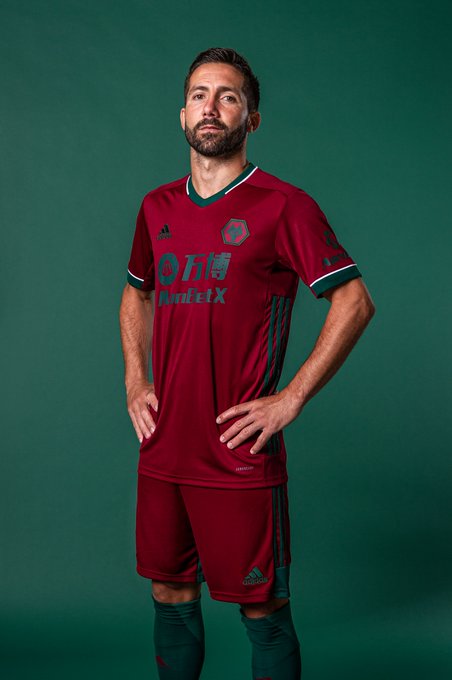
                                    The good thing about that red and green Wolves jersey is that the lack of color contrast de-emphasizes the hideous shirt sponsor, to the point where you almost don't notice it (at least in that photo).

                                    Comment


                                      Crumbs!

                                      https://twitter.com/margate_fc/status/1308477382072897536?s=20

                                      Comment


                                        Jackson Pollocks.

                                        Comment


                                          What a waste(r).

                                          Comment


                                            I actually think I like them (an entire set of recoloured badges aside, obvs) ...but I may just still be in shock.

                                            To think The Libertines once had concerns about Englishmen in baseball caps.

                                            Comment


                                              I think I need to see a proper picture of each of them rather than an animation.

                                              Comment


                                                A bit more John Squire (particularly the pink and grey/yellow) than Barat or Doherty...

                                                Comment


                                                  Huge if true :

                                                  UEFA has banned shirts that have stripes, hoops or similar patterns only on the front but not on the back since their latest Kit Rules change.

                                                  Comment


                                                    Those are some weird kits. Short sleeves up front, long sleeves in the back. The blue/white example at the bottom even has different colors on the front and back of the sleeve.

                                                    Comment

                                                    Working...
                                                    X