
I have to say that I'm rather impressed with the number, variety and quality of those alternative Watford badges, most of which I prefer to the current iteration.
-
-
Q is far and away the best but has no chance against all those excitingly angular, ferocious-looking vespids.Comment
-
I really like that half the badges look like a home counties third division Ice Hockey side. The Stevenage Stingers or something.
I think the pendulum has swung too far in favour of graphic-designy, clean versions of """traditional""" badges and the time is ripe to capitalise on nostalgia for bad '90s graphic design.
From that perspective R, L and E are easily the best and the ones that look like rejected designs for a Manchester City Council rebrand are the worst.
I also like the origami wasp in P and B is kinda cool.
C, D, K, N, Q, S and T can all fuck off for not being fun and the less said about O the better.Last edited by Bizarre L�w Triangle; 12-09-2019, 16:10.Comment
-
The hornet in B looks like a bit of a nag.
L's clever.
There's quite a few Marvel Waspman superheros in there.Comment
-
Did someone say ice hockey?

Comment
-
I think Watford should stick with the unique shape of their badge, so I'd go for J, P or TComment
-
https://en.m.wikipedia.org/wiki/Stevenage_SharksOriginally posted by ursus arctos View PostComment
-
AC Milan update their crest by doing... well not much really, it's more of a identity rebranding than a badge redesign.
Edit: Sake, how hard can this thing make it to add a simple link
Last edited by Mumpo; 19-09-2019, 10:41.Comment
-
It is interesting (at least to me) that they have decided to give the oval such prominence.
I interpret that as an attempt to set them apart from the other two "Italian giants", noting that their city rivals use a circle and guessing that they would not have gone as all in on the shape had Juventus not first abandoned their own oval.
The other clubs with a similarly shaped badge in Serie A at the moment are Atalanta, Bologna, Cagliari, Hellas Verona, and SPAL.Comment
-
E. Obviously.Originally posted by JM Footzee View Post
But the idea is fucking terrible though. If the past few years have taught us nothing, it's that allowing people to vote on stuff comes at a massive price. Ipswich did this with the kit years back, which meant that the eight designs put forward were all shit, and we ended up wearing this monstrosity for two years:

It's got a fucking bend in it.As a homage to... Coca Cola, who sponsored the league at the time.Comment
-
The resolution of that photo makes it look like I'm reading this thread on an Atari 2600.Comment
-
The owner of Mostoles Balompie (a fourth division Spanish side) has changed the club's name to Flat Earth FC, to help expose the illuminati's biggest secret!
Old badge

New badge

Comment
-
Also seems to be an English Channel and Bering Strait denialist, which is even more nicheComment
-
Looking at their old crest, maybe MLS were on their case.- MLS is based in the USA
- USA uses dollars as currency
- Dollar bills have picture of the all-seeing eye

Comment
-
Didn't we do this back when it happened over the summer?Comment
-
That's the Mandela affect caused by the Illuminati time altering technology.Originally posted by ursus arctos View PostComment
-
Not according to a Google site search.Originally posted by ursus arctos View Post
Unless, of course, they removed it.Comment
-
That post really resonates when read in Bernd das Brot's voice.Comment
-
I, J, Q, R and T make it through to the next round. I got the process slightly wrong, there's now a vote on these five and then one will go up against the current badge. I suspect the status quo will prevail - I'm not sure any of the strongest designs made it through, but we'll see. Unsure if I'll vote for my choice of the five (I appear to have been given the option, but wasn't on the first vote - not sure how those fans were selected), if I do I'll go for T.Originally posted by JM Footzee View Post
I'm not absolutely sure, but yes I think entrants were pushed towards doing something with a hornet rather than the hart.Originally posted by ursus arctos View PostComment
-
And Q goes through to the final!Originally posted by JM Footzee View Post
(where it seems highly likely it'll get hammered in by the current badge)
Comment
-
A bit of a round-up,
That Watford competition makes me realise that, when we have a badge vote next year, we shouldn't have a longlist.
It also make me wonder why Watford's spirit insect is a hornet and not the much more alliterative wasp. I could look it up but I prefer to be informed by OTF.
As far as the Wales badge is concerned, I never got on board with the last badge but it was emblematic of our most successful era so, you know, sometimes aesthetics are overshadowed.
Lastly, my reflections on Gloucester are that it seems to be lots of distinctly different areas - the rugby ground area which is exactly as Ray described it, the high street is bucolic with the potential to turn very gammon-mental, the football club is under water and the docks are the best hidden docks ever. I expect they were never bombed.Comment
-
New Chicago Fire FC (before/after)
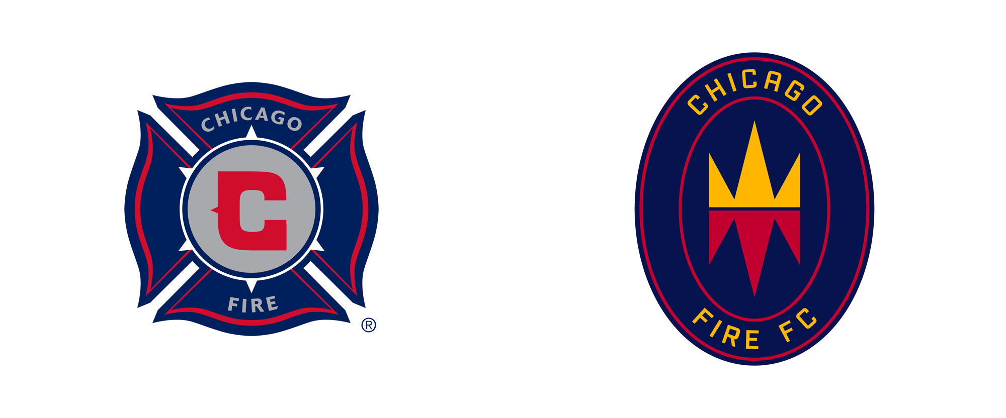
Bit dull.Comment
-
Thought I would post this one as an example of a crest moving away from the chunky-cut style to something more... elegant
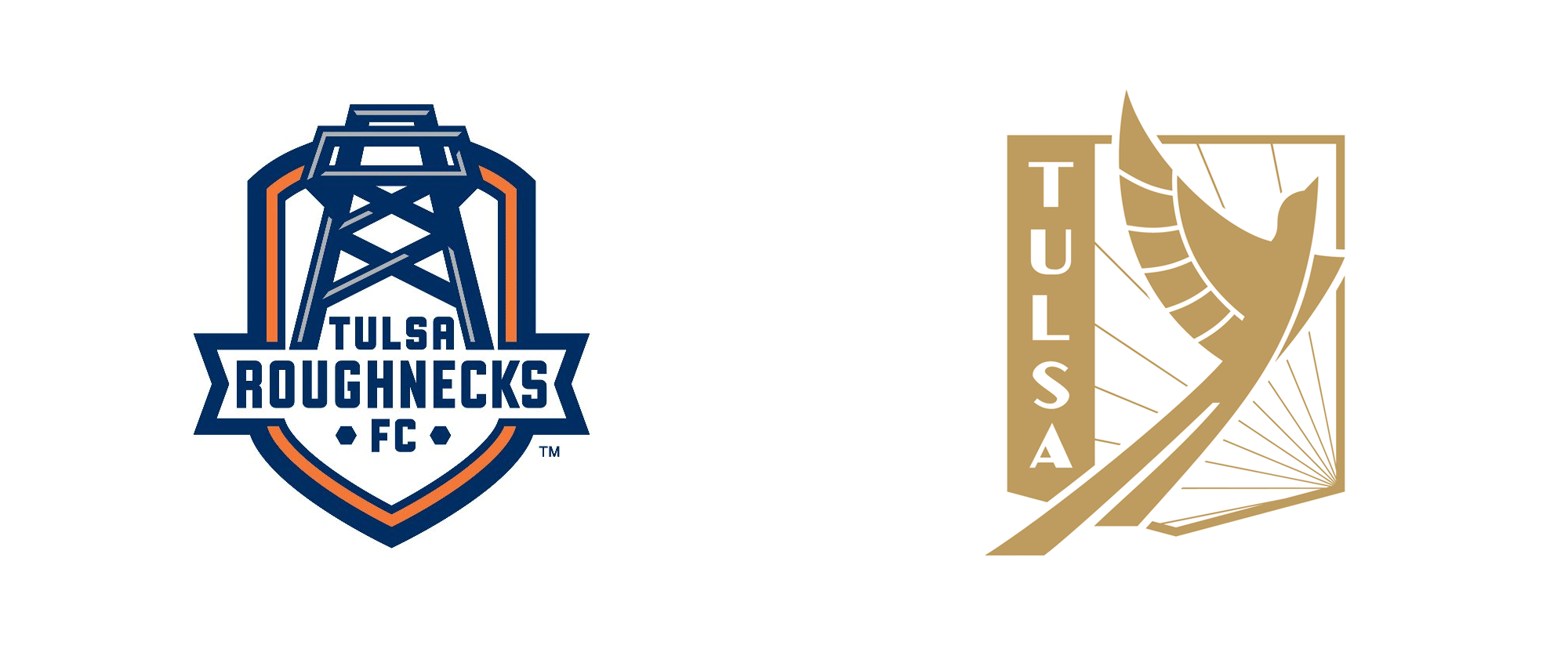
Comment
-
The original is far better there, the new one looks like the logo for a feminine hygiene product.Comment
Comment