'Bitches Brew', the Gilgamesh album cover that was a snakes and ladders game, Soft Machine's 'Bundles' and Ralph Towner's 'Lost And Found' all came close to getting my vote, but I but decided on this one.....
This is mine for a lot of reasons - it just epitomises the energy of the title track which, in it's like form, is my favourite song ever; it riffs brilliantly on the original Mot�rhead logo (which I also love) and it's excellently drawn/painted/whatever. I like the fact it is based on blue as well.
I have to say that, obviously, this is all objective but I find the photos of individuals on covers a la Born To Run and Bleach extremely boring. It's not just anything against the bands - I quite like the cover of Nevermind even if I am not a fan of the band. Indeed, going back to Mot�rhead, even the cover of "No Sleep 'Til Hammersmith" would be boring if it wasn't for the Bomber.
^^ Oh, those are great, Sits. I think the bottom row are a bit too cheesy, though, and in the top-left one Bruce oddly doesn't really look like Bruce somehow – he looks more 'beatnik-y', if that's a word. I quite like the top-centre and top-right pair, though.
Weirdly enough, though, it's only seeing your previous post that made me suddenly realise I apparently hadn't known what the Born To Run cover actually looks like. I honestly don't recognise it at all, even though it's such a famous album and I'd recognise any of Springsteen's other album covers. How have I seemingly never laid eyes on it before??
It's a really 'modern' looking cover, too, which is only adding to the strangeness of this sensation. There's nothing about the design, the typeface or even the clothes that says '1975' in any way shape or form. This is all very disconcerting.
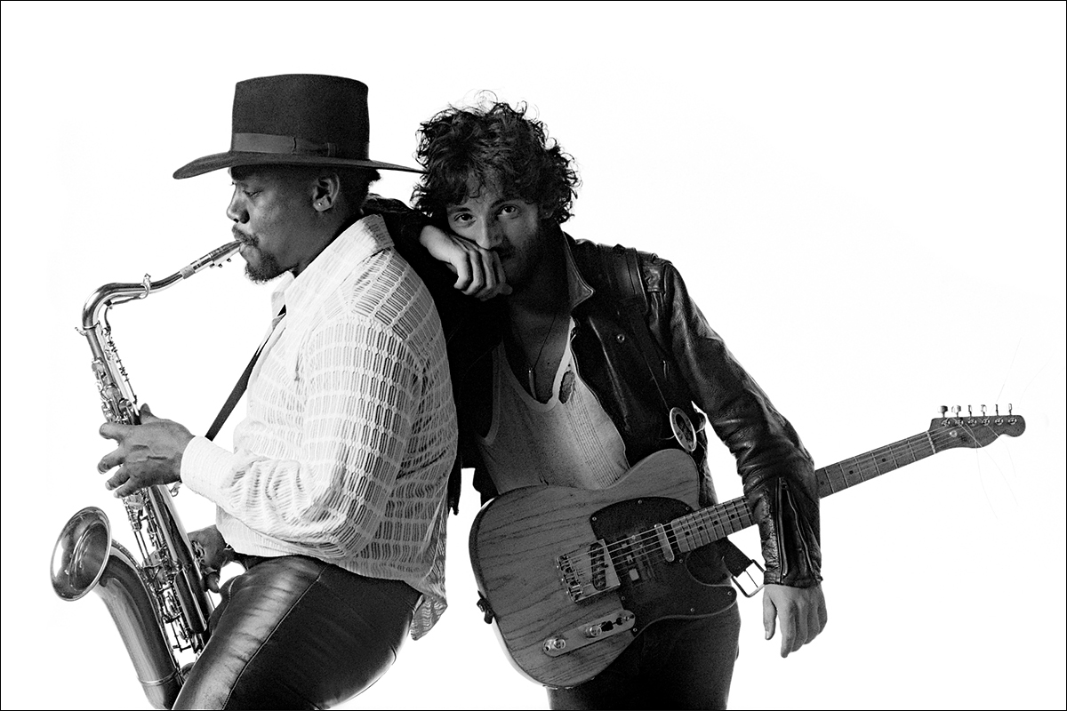
I quite like this out-take too, from the photographer Eric Meola's blog post about the shooting of the cover:
I was amused to discover there that because of the not inconsiderable height difference between the pair, the Boss was standing on a four-inch box for the photos.
Have been looking through my collection and got it down to a shortlist of about half a dozen from there, but I can't get past this one to be honest. It's not technically the 'proper' cover, in that it's a cut-down version of the original design featured on the LP artwork – which has the title in a gap below the stem, then after the gap the stem continues with another set of leaves – in order to work better on a CD case. But since it's the version that I got to know first, and since I think it's actually more striking like this, I'll nominate this one specifically:
even though it's such a famous album and I'd recognise any of Springsteen's other album covers. How have I seemingly never laid eyes on it before??
I’ve used a bit of album cover poster’s licence, in that what I put up was the front cover, and part of the rear. The full “outside gatefold” has a track listing to the left of Clarence, and the front cover is Bruce leaning on someone’s shoulder:
Last edited by Sits; 22-02-2020, 04:15.
Reason: Edit: something weird with the bold type there.


Comment