Announcement

Collapse
No announcement yet.

First Aid Kit - Shirt Gallery 2018/19

Collapse
X
 
  • Filter
  • Time
  • Show
Clear All
new posts

    Teams who wear new kits in a play-off final are just asking for trouble, aren't they? Lose and the kit is hexed forever.

    Walsall, I think they are the club that has changed kits the most successive years -they were doing it was way in the early 90s each season, even before Man Utd.

    I'm going to guess I am in the minority here, but that Stevenage home kit is sensational.

    Good to see that properly-coloured badges are back on the menu. No colourisation.

    Comment


      Originally posted by Kryvbas Gripper Rih View Post
      I'm going to guess I am in the minority here, but that Stevenage home kit is sensational.
      Well, I'll join you in that crowd. A very fine kit.

      Comment


        Even if the fella on the left couldn't find his boots.

        Comment


          That Walsall away kit is essentially what Ross County should be wearing.

          Comment


            Originally posted by blameless View Post
            That Walsall away kit is essentially what Ross County should be wearing.
            Bang on.
            And that Errea template would work beautifully for ICT as well, albeit in a royal blue and with black trim instead of white, thereby incorporating the pre-merger blue of Caley with the red & black stripes of Inverness Thistle.
            The more I see that new shirt, the worse it gets.

            Comment


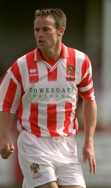
              The Errea kits look dreadful so far, which worries me a lot as a Cheltenham fan. We've been with Errea for 21 years now and we've had some right disasters in that time - apparently we're getting a new one as a tribute to our first ever Football League kit in the 99/00 season so something like this:


              You can be sure Errea will do something to mess it up though.

              Comment


                Yes, it's a bit 'Emperor's New Clothes', that one, Simon.

                Comment


                  Originally posted by Kryvbas Gripper Rih View Post

                  Walsall, I think they are the club that has changed kits the most successive years -they were doing it was way in the early 90s each season, even before Man Utd.
                  I haven’t been paying such close attention recently but believe Cardiff/Tan United have changed their first kit every season since 92/93 (in some seasons more dramatically than others, obvs).

                  Comment


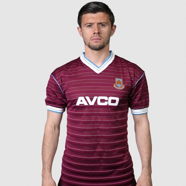
                    West Ham

                    Comment


                      The Atleti one at least dumps the bizarre diagonal slashes through the vertical stripes of this year’s “relegation kit” (ha) but I prefer more blue trim and the hazy blob around the sponsor looks disturbing

                      Comment


                        Originally posted by Kevin S View Post
                        I like a good halved shirt. However most attempts, like these, end up as a dog's dinner. Norwich 2015-16 is another one which got the relegation it deserved.
                        I like a halved shirt, too- incuding that Thistle one.

                        Which Stevenage one is the 1st kit people are liking? I don't like the white n red one, anyway. (I have bad memories of Stevenage from my hitch-hiking years, so usually want them to lose anyway).

                        Comment


                          including that Thistle one.

                          Weirdo. And here was me thinking you were one of the good guys too.

                          Elsewhere, Dundee seem to have gone too far into dark blue this time round:


                          Navy shorts? Navy and midnight blue hoops? Hmmm.

                          Comment


                            It's actually called "Dundee blue" isn't it? I think that's a lush kit.
                            Last edited by Ray de Galles; 25-05-2018, 10:25.

                            Comment


                              Is that West Ham shirt a deliberate nod to the 85-87 "Avco" one?

                              Comment


                                It's actually called "dundee blue" isn't it? I think that's a lush kit.

                                Oh, it's not ugly (and it'll almost certainly be the best-looking kit in the Scottish league this year, given how spectacularly low everyone else is setting the bar), it's just... odd.

                                Comment


                                  Are the darker hoops black?

                                  Comment


                                    I see it as two-tone blue.

                                    Comment


                                      So do I, which makes me ask which one is “Dundee Blue”

                                      Comment


                                        Ah, the lighter one I believe. Though, on checking, I might have been misconstrued Millwall's use of the term as a wider name for the actual colour.

                                        Comment


                                          That's so dark that I thought it was a picture of the All Blacks for a second.

                                          Comment


                                            Call me a heretic but it's better when West Ham don't have blue sleeves. Stops them from looking like Villa's evil clones.

                                            Comment


                                              The solution to that is simple

                                              Comment


                                                Originally posted by 3 Colours Red View Post
                                                Call me a heretic but it's better when West Ham don't have blue sleeves. Stops them from looking like Villa's evil clones.
                                                ...and makes them look like Northampton instead.

                                                Comment


                                                  Originally posted by Ray de Galles View Post
                                                  ...and makes them look like Northampton instead.
                                                  Nah, needs more white for that.

                                                  Comment


                                                    Originally posted by longeared View Post
                                                    West Ham

                                                    Although our new signings are likely to please the crowd, I'm not sure they'll be that effective on the pitch.

                                                    That away shirt is so generic, it doesn't even merit scorn.

                                                    Comment

                                                    Working...
                                                    X