Announcement

Collapse
No announcement yet.

A Design For Strife - Kit Gallery 2017/18

Collapse
X
 
  • Filter
  • Time
  • Show
Clear All
new posts

    A Design For Strife - Kit Gallery 2017/18

    I can see that point of view but most fans would argue the opposite, myself included.

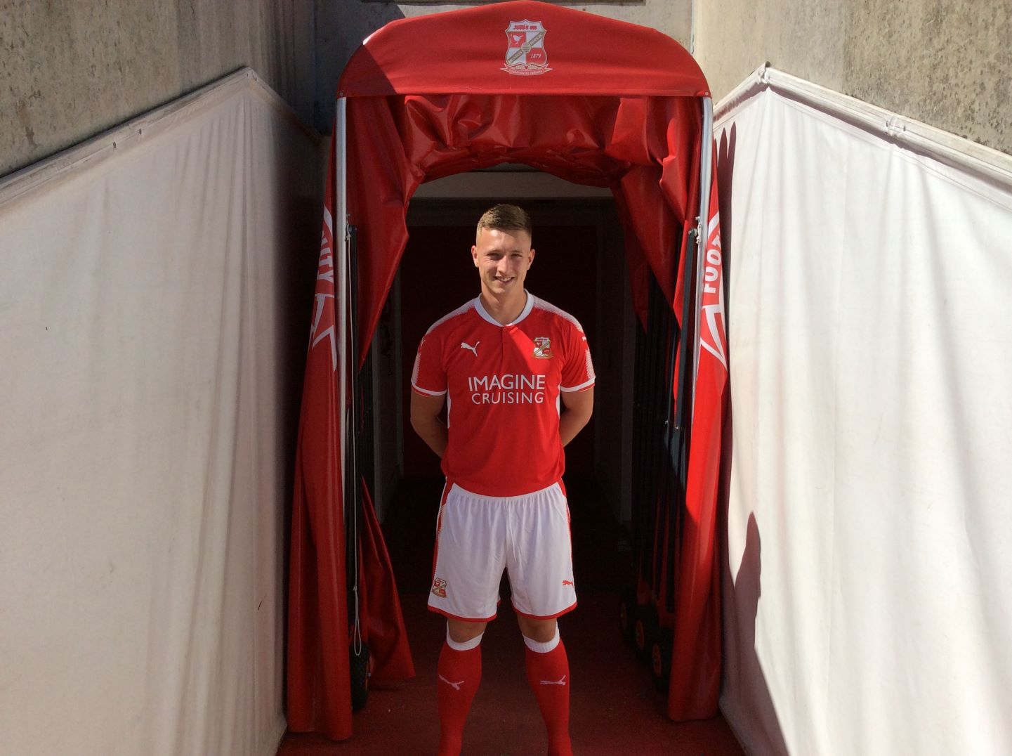
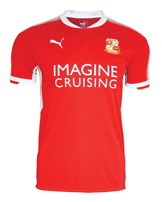
    Even though we're stuck with an incredibly generic kit (as Shelbourne and Tamworth would be able to testify to), I'm at least relieved that we haven't been stuck with white sleeves like we have a few times in the last two decades or so. We're not Arsenal or Rotherham... although if we'd still had Puma as a supplier, I think we would have been at least a couple more times.

    Comment


      A Design For Strife - Kit Gallery 2017/18

      Manchester City


      Dull. The socks are apparently 'maroon-banded' - unsure if this means more than one band or not.

      Comment


        A Design For Strife - Kit Gallery 2017/18

        Ipswich Town change

        Cheap and cheerful look, and unless they draw Palace away in a Cup match there shouldn't be any need for third colours next season.

        Comment


          A Design For Strife - Kit Gallery 2017/18

          Poor quality official photograph, but here is

          Swindon Town

          Comment


            A Design For Strife - Kit Gallery 2017/18

            Better quality one of just the shirt:

            Comment


              A Design For Strife - Kit Gallery 2017/18

              That sponsor never fails to raise a titter, does it.

              Comment


                A Design For Strife - Kit Gallery 2017/18

                A lot of very plain kits being released this season by the looks of it. For example, have we done (and apologies if we have)
                West Ham, change?

                I'm with RdG on the lack of excitement for most black change kits. Especially one with a recoloured badge.

                Comment


                  A Design For Strife - Kit Gallery 2017/18

                  West Bromwich Albion

                  Comment


                    A Design For Strife - Kit Gallery 2017/18

                    Rotherham United change. Very blue and white...


                    ...until you see it close up and realise it's in fact purple.

                    Comment


                      A Design For Strife - Kit Gallery 2017/18

                      We've had worse.

                      Comment


                        A Design For Strife - Kit Gallery 2017/18

                        Ray de Galles wrote: That sponsor never fails to raise a titter, does it.
                        Try working in a school in Swindon where those are regularly spotted.

                        I didn't like the original Keegan shirt in a early incidence of kit purism but I would be inclined to change my views if Southampton supporters are really keen and regard it as traditional. However, didn't they roll over and accept those all red monstrosities a couple of seasons back while we were fighting a similar all red battle? If so, they are not competent defenders of their own heritage.

                        Comment


                          A Design For Strife - Kit Gallery 2017/18

                          The plain red Saints shirt (the same as Bristol City's that season, but with appalling gold trim) and pin-striped one that resembled 80s Liverpool/90s Forest were very poorly received, allowing the club marketing wonks to proclaim "the stripes are back" for an easy win the next season.

                          The main thing is that we aren't fobbed off with a template identikit (Adidas gave Brentford much better kits than us for several seasons) and have something identifiable as uniquely Southampton - many would welcome the return of the white shirt with red sash on a permanent basis, given nobody else in England has that. That's why this season's, if the above post is accurate, will be a success.

                          Now if only they'd stop fucking about and do a yellow and blue change, and we'd all be happy...

                          Comment


                            A Design For Strife - Kit Gallery 2017/18

                            My previous point about 'defending their heritage" was tongue in cheek. I appreciate that many Southampton supporters weren't happy and, to be fair, it was always obviously going to be a temporary measure unlike the goings-on in Cardiff - albeit it went on a season longer than expected.

                            The sash would be brilliant. Why was it the opposite way around when they brought it out a couple of seasons ago.

                            Comment


                              A Design For Strife - Kit Gallery 2017/18

                              andrew7610 wrote:

                              The main thing is that we aren't fobbed off with a template identikit (Adidas gave Brentford much better kits than us for several seasons) and have something identifiable as uniquely Southampton - many would welcome the return of the white shirt with red sash on a permanent basis, given nobody else in England has that. That's why this season's, if the above post is accurate, will be a success.
                              While agreeing that being one of many clubs with the same template kit is dull (and liking the "reverse Ajax" and "sash" shirts as occasional diversions) , I'm troubled by the idea of a club like Soton ditching the stripes permanently just to have something "unique".

                              There's nothing wrong with sharing a basic traditional kit design with other teams, it can still be executed in an interesting way by a club and manufacturer who are willing to bother.

                              However, while looking for some background on The Saints' kit history I found an interesting comment on a supporter's website - if your formative years as a supporter were the eighties then the club didn't wear traditional stripes for a few months short of that entire decade so your attachment to them would be much less, I imagine.

                              I also found this thing of beauty :

                              Comment


                                A Design For Strife - Kit Gallery 2017/18

                                Bordeaux Education wrote:

                                The sash would be brilliant. Why was it the opposite way around when they brought it out a couple of seasons ago.
                                My guess would be to better accommodate the club badge in the traditional position.

                                Comment


                                  A Design For Strife - Kit Gallery 2017/18

                                  Ray de Galles wrote:
                                  Originally posted by Bordeaux Education

                                  The sash would be brilliant. Why was it the opposite way around when they brought it out a couple of seasons ago.
                                  My guess would be to better accommodate the club badge in the traditional position.
                                  The original Saints wore an actual sash, and there doesn't seem to have been any decision on which way it should go:

                                  Comment


                                    A Design For Strife - Kit Gallery 2017/18

                                    That is a brilliant piece of information, thanks.

                                    Comment


                                      A Design For Strife - Kit Gallery 2017/18

                                      Oh wow, yes that is astonishing. Are all early 'sashed' kits representative of similar origins, do we think?

                                      Comment


                                        A Design For Strife - Kit Gallery 2017/18

                                        Liverpool change. What's Milner looking awkwardly at?

                                        Comment


                                          A Design For Strife - Kit Gallery 2017/18

                                          Denis, you've surpassed yourself today:

                                          Comment


                                            A Design For Strife - Kit Gallery 2017/18

                                            Inter

                                            Comment


                                              A Design For Strife - Kit Gallery 2017/18

                                              As I'm at pains to point out in the accompanying article, it was a request from a dark mind!

                                              Comment


                                                A Design For Strife - Kit Gallery 2017/18

                                                Cambridge United

                                                Comment


                                                  A Design For Strife - Kit Gallery 2017/18

                                                  Having just seen it in the, erm, flesh, what colour is that new Liverpool kit supposed to be?

                                                  Comment


                                                    A Design For Strife - Kit Gallery 2017/18

                                                    They are green pinstripes

                                                    Comment

                                                    Working...
                                                    X