Announcement

Collapse
No announcement yet.

Badge-y Comic

Collapse
X
 
  • Filter
  • Time
  • Show
Clear All
new posts

    Badge-y Comic

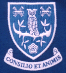
    Wednesday are to go back to an old crest which was designed in 1956. I sort of like the idea, but I'm not at all sure I like the crest. I've become used to the stylised owl that we've had since the 70s. This one (the owl, anyway) looks like the illustration from a children's book, and I think the font of the SW is rubbish. Plus I'm not keen on the up-fronting of the Latin bit. I guess I'll get used to it.

    #2
    Badge-y Comic

    The club announced without warning on Twitter yesterday afternoon that we were to get a new crest and to see the website for details. There was an interval of several minutes before the crest appeared which led to a lot of "oh God, what's it going to look like" before general relief at what we unveiled.

    Chansiri has unwittingly dug a hole for himself here though, if / when things go wrong the old badge will become a symbol for fans to rally behind.

    Comment


      #3
      Badge-y Comic

      Is that the actual badge, or a version you've just sketched?

      Comment


        #4
        Badge-y Comic

        It's a bit too William Morris, arts and crafts-y, isn't it?

        That said, given prevailing facial hair trends among players, it might be a logical next step.

        Comment


          #5
          Badge-y Comic

          So, what's the thinking here then? Was the old one too easy for bootleggers to knock off?

          Comment


            #6
            Badge-y Comic

            I suspect there's an element of that. Ostensibly it's a nod to our heritage to tie in with the club's 150th anniversary next year.

            Comment


              #7
              Badge-y Comic

              I quite like it - it's not amazing, but it's a proper badge - rather than a corporate logo.

              Comment


                #8
                Badge-y Comic

                The yellow eyes make me think of...

                Edit: Sorry, I see you've already pointed that out. As you were.

                Comment


                  #9
                  Badge-y Comic

                  It's a bit Hamlyn Big Book Of Heraldry. I quite like the stylised owl too; it's the most interesting thing about Sheffield Wednesday.

                  Comment


                    #10
                    Badge-y Comic

                    Comment


                      #11
                      Badge-y Comic

                      It's not exactly the same as the original 1956 badge, is it? The club's website says it's a "powerful representation" of it and talks about a new design process.

                      I presume that's because there is a problem with using old club badges as they have been in the public domain too long to copyright.

                      Comment


                        #12
                        Badge-y Comic

                        Very close


                        The eyes of the owl are the most telling difference.

                        Comment


                          #13
                          Badge-y Comic

                          I think actually, digging around, this is the original (the things either side of the owl are sheaves of wheat (to represent Sheffield)

                          Comment


                            #14
                            Badge-y Comic

                            That's much better, not least because the head isn't emerging out of a weird shoulder bum.

                            Comment


                              #15
                              Badge-y Comic

                              They used the sheaves of wheat badge in at least one Cup Final in the 60s (when it was common for clubs to have special badges for such occasions).

                              Comment


                                #16
                                Badge-y Comic

                                Yes, Cardiff had the city's crest on their shirts for the 1927 Cup Final (and the 1925 one too, I think) but apart from one being used in 59/60 they didn't adopt a badge regularly until 1965.


                                It must be hard to assess exactly what 1956 design Wednesday are talking about given it wasn't ever actually used on shirts. What did it appear on, if anything?

                                .

                                Comment


                                  #17
                                  Badge-y Comic

                                  These, for one


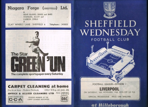
                                  It also featured on programmes:


                                  and a wheat sheaves example from 1968:

                                  Comment


                                    #18
                                    Badge-y Comic

                                    Quite a difference from the design on the OP then, though that might be only reproduction issues.

                                    Where is the design in your 15:22 post from?

                                    Comment


                                      #19
                                      Badge-y Comic

                                      Football Badge Guide

                                      Comment

                                      Working...
                                      X