Announcement

Collapse
No announcement yet.

First Aid Kit - Shirt Gallery 2018/19

Collapse
X
 
  • Filter
  • Time
  • Show
Clear All
new posts

    Wish they'd introduce some sort of tribute kit to this

    Comment


      Originally posted by ursus arctos View Post
      Of course a club that plays in green and black stripes needs five different kits.
      It's not like they're the first Italian team with distinctive colours to end up with four change strips simultaneously. They've just nicked the idea from Fiorentina.

      Comment


        There's only two changes, and two goalkeeper kits, in these pictures.

        Comment


          Sorry, off topic.

          My mind is still blown by the fact that Mapei sells adhesives, grouting, etc, and not Starburst type sweets. What though, does the GB represent in the red circle on the shirt? They were now selling their products in Great Britain?

          Comment


            Am I the only one who sees "Kombat 2019" on that Sassuolo stuff and get made a little uneasy by how close it is to Combat 18?

            Comment


              Originally posted by San Bernardhinault View Post
              Am I the only one who sees "Kombat 2019" on that Sassuolo stuff and get made a little uneasy by how close it is to Combat 18?

              Comment


                Originally posted by Kevin S View Post
                There's only two changes, and two goalkeeper kits, in these pictures.
                Goalkeeper kits should have long sleeves with padded elbows, and padded hips on the shorts.
                Modern fitba - pah!

                Comment


                  GB was an Italian supermarket unrelated to Mapei

                  SB, no you are not; it gets me every time Kappa introduces a new kit

                  Comment


                    Ahh, thanks for that.

                    Comment


                      Originally posted by ursus arctos View Post
                      PSG change (shirts and socks also white)

                      In the 40 years plus I have been following PSG, I can't recall anything uglier than this associated with the club in any shape or form.

                      Comment


                        I know it's been mentioned before but some manufacturers, Kappa being one, seem to be gradually migrating the club badges and logos higher and higher until, presumably they'll eventually become epaulettes.

                        Comment


                          Originally posted by tracteurgarçon View Post
                          I know it's been mentioned before but some manufacturers, Kappa being one, seem to be gradually migrating the club badges and logos higher and higher until, presumably they'll eventually become epaulettes.
                          So they can still be seen during post-match interviews, innit?

                          Comment


                            Burnley away.

                            Comment


                              Is this Milan third the most ridiculously redundant kit in football history?

                              Comment


                                We've got a few Norwich fans you can ask.

                                Comment


                                  Beat me to it 3CR!

                                  Comment


                                    That Milan kit can be worn against teams in red and white stripes, against whom the striped home and white away would clash - they've often had black third kits (and occasionally all-red, perfect for playing Juventus).

                                    Similarly, that Norwich third kit was the season they had a green and yellow halved home shirt. The green away was able to be used against Watford and, had they played someone like Plymouth, the third would have been fine as the green is outweighed by the two shades of yellow (or yellow and orange, I'm not really sure).

                                    Comment


                                      There haven't been any Serie A clubs that play in red and white stripes for at least a decade (Vicenza is the last one that comes immediately to mind).

                                      Comment


                                        Yeah, I had to check at what level they play now. My point though is that there aren't really many games where they'll need a third - Juventus have a white back so the home should suffice with black shorts and socks. I'd expect all-white to be okay against Udinese.

                                        Obviously, a different colour than black for the third would be better but we live in an era when Manchester City have a navy away and a dark purple third.

                                        Comment


                                          It was more the choice of red sleeves for the black kit that I found ridiculous. As you note, "black for Black's sake" has been a thing in Italy for a while, but Milan going for black and red is just taking the piss.

                                          Comment


                                            Originally posted by Various Artist View Post
                                            Beat me to it 3CR!

                                            That's a Northampton rugby "European kit".

                                            Comment


                                              Parma (change)

                                              Comment


                                                Didn't they care before 1998?

                                                Comment


                                                  Originally posted by Gangster Octopus View Post
                                                  Didn't they care before 1998?
                                                  Heh.

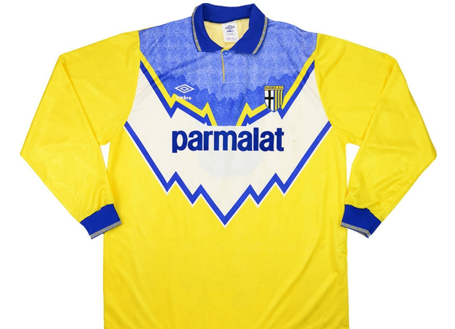
                                                  Parma hit on that design just as they entered their most celebrated period (Buffon, Thuram, Cannavaro, Veron, Crespo, Dino Baggio, Bennarivo, Ricky Church...) and this, as their online ad is making clear, is a deliberate attempt to align the modern Parma footballing entity with that heritage now it's back in Serie A. It was originally intended as the away kit, but it was so popular and iconic it became the main kit. When Buffon wasn't using it as a goalie shirt.

                                                  The best effort before that was the drawstring collar pre-war look of the kit used when we lost the ECWC final to Arsenal.


                                                  Around that era there was usually the white kit, which was the main one, the yellow kit in the same design as the white one and then the blue one in the same design again, presumably theoretically for when broadcasting required a darker alternative, but possibly also because fans preferred the blue one for casual wear. As I did when I had the choice of all three in that sports shop in Roma.


                                                  In the early 90s they went a bit Leeds and occasionally attempted a geometric yellow-blue mix with equally startling results.


                                                  When the hoops were the main kit they started dabbling in black as a second or third colour which led to this season's much admired third shirt. Last season they went completely off piste and had a red and white third shirt sporting the historically resonant large cross design which would not have looked out of place on the crusades (or as a very bold England second shirt). Originally, I loathed it, but gradually grew to like it. Then we got promoted in it and I own one.

                                                  Comment


                                                    Parma's 1990-91 home shorts and socks (they switched to all-white in 1991-92, I think) were exactly the same as Leeds' away sets of that time.

                                                    Comment

                                                    Working...
                                                    X