
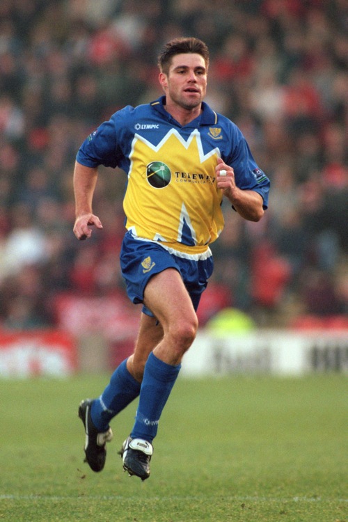
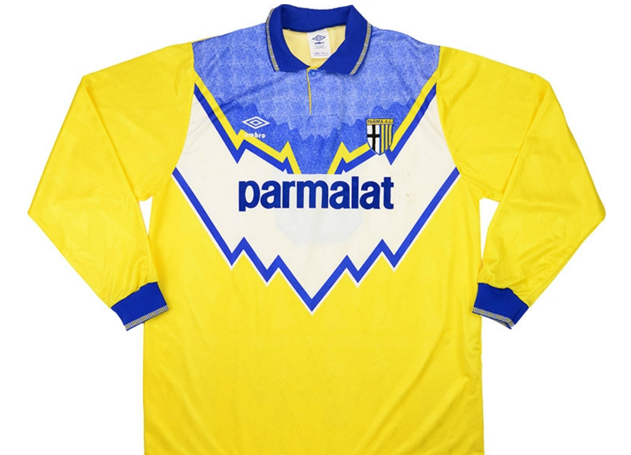
Parma hit on that design just as they entered their most celebrated period (Buffon, Thuram, Cannavaro, Veron, Crespo, Dino Baggio, Bennarivo, Ricky Church...) and this, as their online ad is making clear, is a deliberate attempt to align the modern Parma footballing entity with that heritage now it's back in Serie A. It was originally intended as the away kit, but it was so popular and iconic it became the main kit. When Buffon wasn't using it as a goalie shirt.
-
In the Football Italia days, I used to enjoy pretending to the more casual spectators (my flatmates; Ms Felicity; my Dad) that he was called Dean O'Baggio and eligible for Ireland. -
As modelled there by Carl Shutt, shielding the ball from Franco Baresi (or was it the Irish born Frank O'Breacy?).Originally posted by denishurley View PostComment
-
Is that a Derby Star football as well?
Actually might be a Uhlsport one on looking slightly closer.
Both available via mail order in Shoot and Match anyway.Comment
-
Similar in geometric spirit to the Oldham Athletic 1991-92 and to the Celtic 1991-92 designs then, both away shirts and both Umbro horrors.Originally posted by statto99 View Post


And to the "custard splat" design of the Southend United 1996-98 home shirt.
 Last edited by P�rou Flaquettes; 07-08-2018, 20:24.
Comment
-
I think I’ve told the story before but that yellow splat on the Southend shirt was literally sketched on the back of an envelope by their chairman to get around ubiquitous sponsor Telewest’s complaints about their green logo not showing up on blue.Comment
-
Haha, nice one.Originally posted by Ray de Galles View Post
The Parma design and the Oldham one aren't just similar, they're actually identical (I've just noticed!), Umbro didn't exactly strain themselves on this one...Comment
-
And the only difference with the Celtic one is that the dragged down the far right part.
Galatasaray were honoured with it too.

Comment
-
As a fan of yellow and blue together, that new Parma kit may as well be porn to me. What a beautiful thing it is.Comment
-
It speaks to the standard of sports journalism in Scotland that when Celtic unveiled that horror show above, the main headlines weren't "eeuuuuurrrgh that's a fucking minging shirt, what were they thinking?" but instead "oh my god, Celtic have got a tiny bit of blue on their shirts!" due to the Ford-punting sponsor...Comment
-
I did hear fans say that at the time, too but placed it in the 'breathe/ignore/move on' box alongside 'youse wear orange but, nae wunner yez sell the pass to the huns'Comment
-
Aren't those kits in tribute to surrounding mountains a la the Slovenia kits?Comment
-
Glasgow, Parma, Oldham, Southend and Istanbul all being renowned for their Alpine sceneryComment
-
Indeed. They are also twinned with each other. Or, possibly, quintupletted.Originally posted by ursus arctos View PostComment
-
http://www.bbc.co.uk/bbcthree/articl...d-c6c4b6dd3f75
Yes, he is every bit the twunt that this description threatens.To help us separate this year’s most fashionable from the biggest kit fails, we spoke to kit connoisseur and designer Marlon Feeney-Thompson, also known as Settpace.
The 24-year-old designs concept and real world kits for sportswear brands and video games, often integrating designer brands and elements from fashion to level-up a team’s look.
Although he is right about the Saints kit.Comment
-
"Their home kit is pretty much the same as always, so they take a hit on originality for that"
I don't know why I expected better than this when I clicked on the link, but still...Comment
-
Leeds change

Don't mind that at all.Comment
-
Is it paying tribute to the mountains around Leeds?Comment
-
Unsure what this is paying tribute to.

Pyjamas maybe?Comment
-
...other than it having a Leeds badge on it, etc. etc. etc.Originally posted by The-Reverend View Post
I do like it too I have to say - feels like it should be a Parma kit though.Comment
-
Leeds supporters' reaction to the new third kit has, eventually, been favourable after a few hours of "What... on... EARTH...".
One fan suggested the pattern reminded them of a famous photo of one of Yeboah's volleys. If you screwed your eyes up. Quite a bit.Comment
-

Comment
-
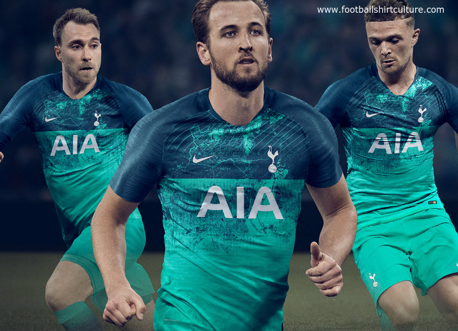
It's only when you see the kit in action that you can properly judge it and I properly judge that Spurs away kit is horribleComment
-
Isn’t it a green third kit as opposed to the blue change? Or are the photos I’ve seen on the BBC site misleading?Last edited by Ray de Galles; 11-08-2018, 12:58.Comment
-
It's green alright,didn't know it was the third kitComment

Comment