Announcement

Collapse
No announcement yet.

First Aid Kit - Shirt Gallery 2018/19

Collapse
X
 
  • Filter
  • Time
  • Show
Clear All
new posts

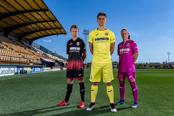
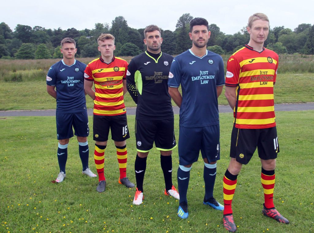
    Ooooh, I like the Thistle and Brentford kits, particularly nice to see brown back on the palette for English football. The Jags lose points for the colourised badge on the change, natch.

    I think I'm probably alone in finding the Derby shirts dull, the Umbro trim is good but should go all round the sleeve.

    Comment


      Technically, the home badge is a colourised version too (our badge is black and white, not black and yellow) but works better anyway.

      The only two real problems I have with the home kit are the stupid collar, and the hoops stopping at the chest rather than going all the way up or onto the sleeves.

      The Forfar-esque away is pretty inoffensive apart from the daft collar.
      Last edited by blameless; 18-06-2018, 11:32.

      Comment


        Aberdeen Change


        Meh. But at least it's not blue.

        But that with red trim would've been lovely.

        Comment


          But that with red trim would've been lovely.

          Wouldn't it though? Seems strange that adidas have successfully recreated the Dandies' 1985 home kit but then tripped over the seemingly low hurdle of recreating the change kit of the same period:


          Comment


            Is that Aberdeen change the greyest kit ever? It reminds me of the old Steve Bell cartoons of John Major.

            Comment


              Doncaster Rovers' awful kits are already in their second incarnation after shirt sponsor Virgin Trains lost the East Coast rail franchise, meaning their trains no longer go anywhere near Doncaster. LNER have stepped into the breach, both as franchise operator and Rovers' shirt sponsor. Poor bastards.


              Nice of the club to iron them before putting them on the mannequins.

              Comment


                Originally posted by dogbeak View Post
                The goalkeeper's mum? I thought it was Steve Bruce.
                Sadly the man who blogged Men Who Look Like Old Lesbians hasn't updated his site in a long time. (I did once email him to suggest Steve Bruce.)

                Comment


                  Villareal (third, first, change)

                  Comment


                    Comment


                      "Mind your car for a fiver, mate"

                      Last edited by Ray de Galles; 18-06-2018, 12:52.

                      Comment


                        Originally posted by ember View Post
                        New Thistle kits...
                        “Just Employment Law” - company, or activist movement?

                        Comment


                          Originally posted by Бога Нет View Post
                          Is that Aberdeen change the greyest kit ever? It reminds me of the old Steve Bell cartoons of John Major.
                          Quite possibly.
                          Apparently the AFC marketing department are passing the colour off as "Granite".
                          It wouldn't have been so appallingly bland had they used an accent colour for the stripes (other local quarries produced pink, buff & black granite if they insist on that as the "inspiration"), or if they'd reversed the dark / light grey on the shorts & socks.
                          Initial reaction on messageboards seems largely positive though.

                          Originally posted by blameless View Post
                          But that with red trim would've been lovely.

                          Wouldn't it though? Seems strange that adidas have successfully recreated the Dandies' 1985 home kit but then tripped over the seemingly low hurdle of recreating the change kit of the same period
                          100% agree, I'm of an age that considers white / black to be The Dons default alternative colours - but nowadays a change kit is far more about its suitability as "leisurewear" than an actual change of colours for the team to play in.

                          Comment


                            Originally posted by The Red Max View Post
                            Aberdeen Change


                            Meh. But at least it's not blue.

                            But that with red trim would've been lovely.
                            TRM, any idea why Aberdeen and Hamburg both changed kits for second leg of 1983 Super Cup, Aberdeen in white/black and Hamburg in all-red, when both had worn their usual kits in Germany?

                            Comment


                              A hint for fathers of teenage daughters. If your 16 year old comes in wearing this dress as her latest purchase ;


                              It's probably not the best idea to say "Oooooh, very USA 95-98 change kit".


                              That's not my daughter above btw, she is far more beautiful than the model from their website.

                              Comment


                                Is the fit on that Aberdeen change shirt a bit weird? If that's how flattering it looks on a professional athlete, I dread to think what it'll look like on the average bloke. I suppose the weird fit around the gut might not be as obvious if Aberdeen denizens tuck their football tops into their crap 90s jeans as seems to be the fashion around here.

                                Comment


                                  Originally posted by Jobi1 View Post
                                  Hibs go for a fairly simple, quite smart inverse negative thing. Not sure what's going on with that diamond hatching on the home top though.

                                  I had thought it was just the lighting in the original picture, but it turns out that Hibs shirt actually has different shades of green. Not sure about that at all...

                                  Comment


                                    That does serve as a handy guide though: on the left - the shade of green most recent Hibs kits have been; on the right - the shade of green all Hibs kits should be.

                                    Comment


                                      I like it, though I've only just spotted the 1875 on that larger photo and that's messy.

                                      Comment


                                        Originally posted by Fussbudget View Post
                                        Is the fit on that Aberdeen change shirt a bit weird? If that's how flattering it looks on a professional athlete, I dread to think what it'll look like on the average bloke. I suppose the weird fit around the gut might not be as obvious if Aberdeen denizens tuck their football tops into their crap 90s jeans as seems to be the fashion around here.
                                        I hadn't noticed until you pointed it out, but yeah it does look odd, not just the midriff but also the shoulders & sleeves.
                                        I can only think that they've only been given one XL shirt from adidas and Scott McKenna wasn't available to model it.
                                        So McGinniesta has either got two handfuls of shirt behind his back, or a whacking great bulldog clip pulling it together.

                                        *Edit*
                                        Oh, and in reply to DenisHurley with regards to AFC & HSV both wearing their change colours in the Super Cup 2nd leg - I've absolutely no idea mate, and I don't recall anything being said about it at the time either.
                                        But you've sparked my interest, so I'll see if I can find out.
                                        Last edited by The Red Max; 19-06-2018, 12:48.

                                        Comment


                                          Originally posted by andrew7610 View Post
                                          Southampton's home kit has a plain red back and black socks FFS - the whole ensemble would make a great Sheffield United kit.

                                          There's rumoured to be a third shirt (as yet unconfirmed) which apparently Sky have insisted on, for when we play other striped teams:
                                          That is a fucking shite shirt.

                                          Comment


                                            New Lincoln home kit, and I want to hunt down the supporters that were consulted. There's retro, and then there's bloody horrible retro. Just stinks of 1980s non-league, it's so cheap looking. Plus, I don't like seeing SUK so largely printed on the front...
                                            Last edited by RobW; 19-06-2018, 17:17.

                                            Comment


                                              Commiserations, awful to go out of the League so soon after regaining your place.

                                              Comment


                                                Originally posted by Бога Нет View Post
                                                A hint for fathers of teenage daughters. If your 16 year old comes in wearing this dress as her latest purchase ;


                                                It's probably not the best idea to say "Oooooh, very USA 95-98 change kit".


                                                That's not my daughter above btw, she is far more beautiful than the model from their website.
                                                I saw the 1994-95 AC Milan change shirt in Debenhams not so long ago:

                                                Comment


                                                  Official Wolves.


                                                  Bristol City with retro badge, talk that it's different badges on the shirts this season and the sponsor is Dunder, but as they are a betting co. then the kids versions are like this:

                                                  Comment


                                                    Those Wolves shirts are nice although perhaps the sponsors logo could be a bit bigger...

                                                    Comment

                                                    Working...
                                                    X