Announcement

Collapse
No announcement yet.

Who likes looking at maps?

Collapse
X
 
  • Filter
  • Time
  • Show
Clear All
new posts

    The seat, birthplace and university of every UK PM since 1902:

    https://mobile.twitter.com/ElectionM...57940853628929

    Comment


      Originally posted by Furtho View Post
      Map on a British Rail poster promoting the InterCity network, 1982.
      Trains to Dover going from Charing Cross / Waterloo? Or was that a proposed change that never came about?

      Comment


        Originally posted by Furtho View Post
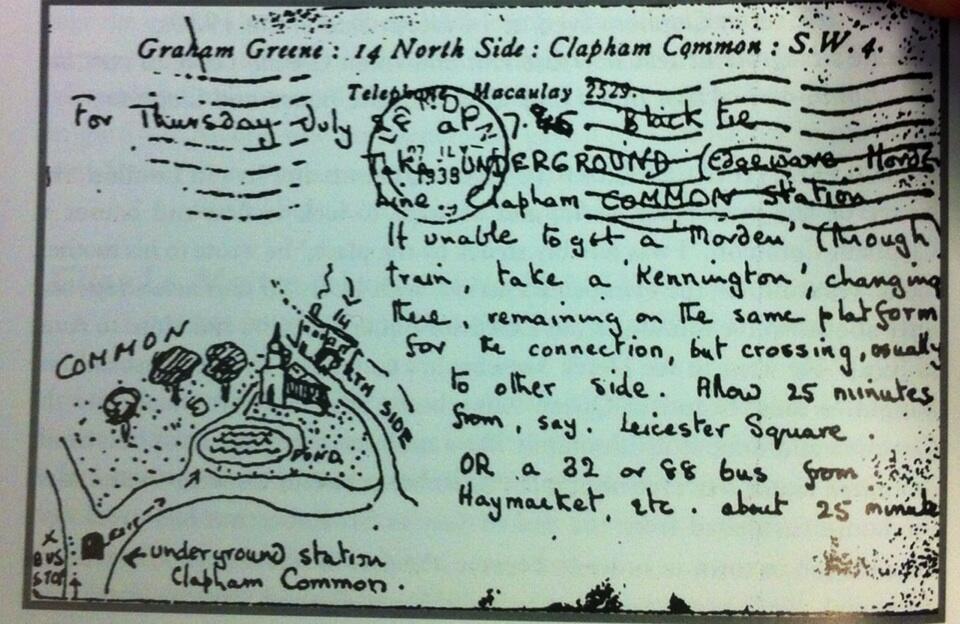
        Map showing the route of a competitive pub crawl organised by the South West London Vietnam Ad-Hoc Committee to celebrate the 150th birthday of Karl Marx, 1968. Should you wish to retrace the steps of the participants, a larger version is
        We Irish are rarely ones to shy away from a drinking session, but a 25-stop pub crawl seems a bit excessive.

        Comment


          Originally posted by Walt Flanagans Dog View Post
          Trains to Dover going from Charing Cross / Waterloo? Or was that a proposed change that never came about?
          There are regular trains from Charing Cross/Waterloo (East) to this day, though it takes a bit longer than on the map.

          Comment


            Originally posted by seand View Post
            We Irish are rarely ones to shy away from a drinking session, but a 25-stop pub crawl seems a bit excessive.
            It did look on the ambitious side, but the spirit of the revolution was at stake.

            Comment


              Showing numbers of passengers in millions, a stylised map of the Berlin underground, 1927. Big version here.

              Comment


                Charming aerial view map showing sightseeing spots around the Awa Railroad, Shikoku, Japan, 1931. Huge version here.

                Comment


                  I love that Berlin U-bahn map. I'd be interested to see one of those for 2017 London, but I imagine it would be too unwieldy.

                  Comment


                    Stylised city railway map showing the "43 independent lines (18 steam and 25 interurbans)" entering Indianapolis, 1907. More info here.

                    Comment


                      How much time do you spend looking at maps Furtho? Long may it continue, I hasten to add.

                      Comment


                        Actively looking, five minutes a day? But sometimes, as with all three of the maps on this page, I just get lucky on Twitter.

                        Comment


                          Originally posted by Furtho View Post
                          Showing numbers of passengers in millions, a stylised map of the Berlin underground, 1927. Big version here.

                          This is fucking ace. Poster size print, pls.

                          Comment


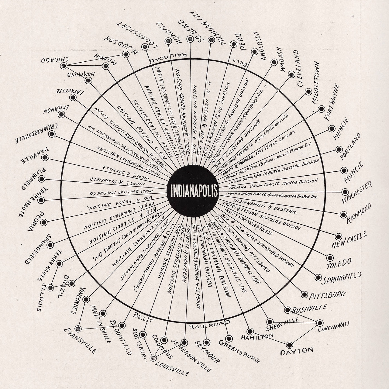
                            Not a map, but "who likes looking at graphs?" might be a short thread.

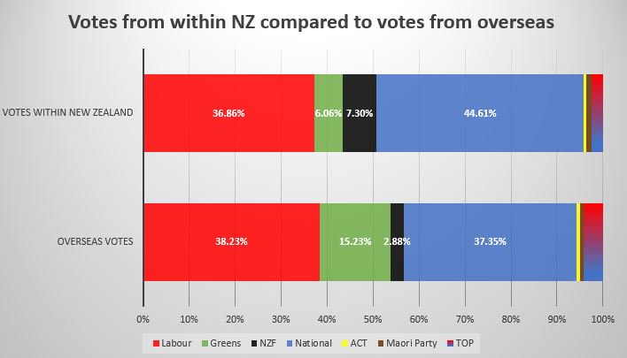
                            Votes in the recent New Zealand election: those Kiwis that OTFers meet in London pubs are not representative of the population back home - more than twice as Green, for example:

                            Comment


                              I'm a sucker for a hand-drawn map. Here's one by Graham Greene, part of an invitation to a party at his house on Clapham Common, 1938.

                              Comment


                                Probably hardly needs explaining that this is a map of bus routes in Tokyo, c1950. Big version here.

                                Comment


                                  We all know about CityMetric, I assume?


                                  Example:

                                  http://www.citymetric.com/transport/...port-dprk-3421

                                  Comment


                                    Very interesting piece about Pyongyang there, GP.

                                    And speaking of the DPRK, here's a forecast map of a bomb like that of their latest test exploding over Tokyo's Nagatacho (notes my correspondent, "and we'd still be stuck with that eyesore Kawasaki... sad!").

                                    Comment


                                      Geographic distribution of waterway names in Britain


                                      With more on it here, at Atlas Obscura

                                      Comment


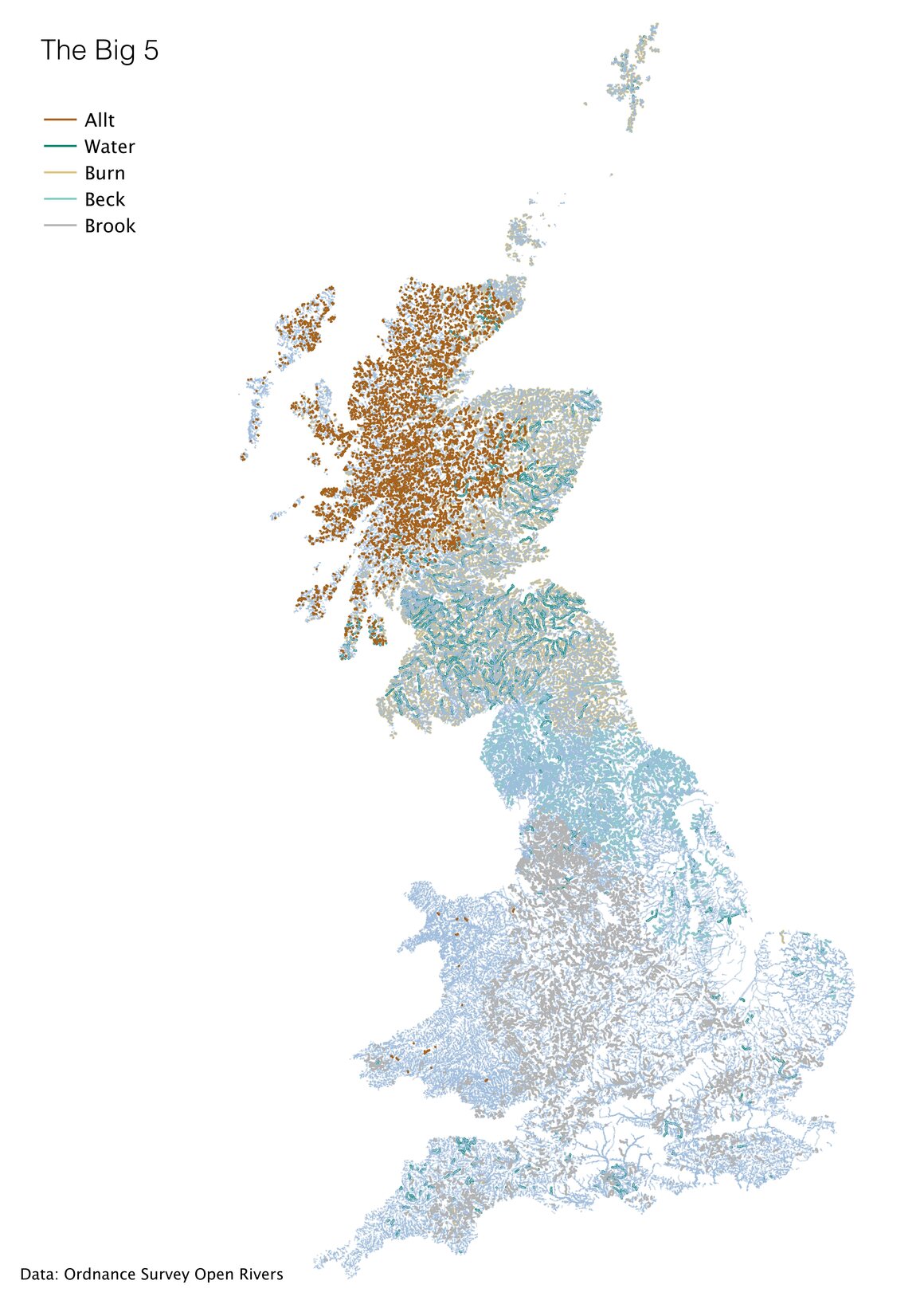
                                        Lovely, SB. On a related note, previously I posted an 1851 map showing by (English-only) county the proportion of parish names that refer directly to water, here.

                                        Anyone interested in maps and the history of Poland might want to take a look at this long-form article on the cartographical manifestations of the country when it, well, wasn't a country.

                                        Comment


                                          Super-detailed San Francisco wall map, compiled for use by the fire-insurance industry, 1874. More info here, big version here.

                                          Comment


                                            That's excellent

                                            Flynnie's old stomping grounds are miles off the map to the left

                                            Van Ness Avenue, the major break for the post Earthquake fire is about 1/3 of the way from the left edge, and the upper right corner shows how the grid had already been extended to cover lots of blocks that were still underwater.

                                            Comment


                                              Map showing the number of KFC outlets in European countries.

                                              Comment


                                                I bet of the 100 in Spain, a large majority will be on the Costas... where Brits go.

                                                Comment


                                                  Yeah, I wonder if that's true. Certainly the number in the UK is very striking.

                                                  On a rather different note, a map showing the distribution of the slave population in the southern states, compiled from the census of 1860. More info here. Big version here.

                                                  Comment


                                                    Originally posted by Furtho View Post
                                                    Map showing the number of KFC outlets in European countries.

                                                    I’m confident that KFC is more popular abroad than in the US

                                                    Comment

                                                    Working...
                                                    X