
Terrible pub signs
The draughtsmanship isn't bad and it was a bit of a job to capture the name of the pub in graphic form, but forming the letter "G" our of some orange (because it rhymes) peel seems poor:
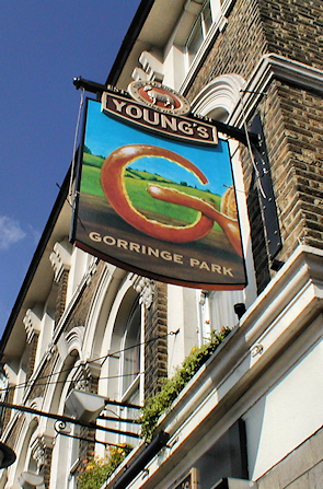
The draughtsmanship isn't bad and it was a bit of a job to capture the name of the pub in graphic form, but forming the letter "G" our of some orange (because it rhymes) peel seems poor:


Comment