Announcement

Collapse
No announcement yet.

Our new badge what do you think?

Collapse
X
 
  • Filter
  • Time
  • Show
Clear All
new posts

    Originally posted by Patrick Thistle View Post
    I don't know what the previous badges are meant to show. And I like birds. So....
    The City coat of arms included this shield in the center.

    The shield in the coat of arms of King's Lynn and West Norfolk that of the ancient Borough of Lynn, recorded at the College of Arms in 1563.

    Comment


      Photo and explanation here. The dragons' heads are impossible to read on the old badge.

      https://www.heraldry-wiki.com/herald...=King%27s_Lynn

      Comment


        Spanish top flight clubs as of 2018 (comprehensive, but in annoying slide show format with interstitial ads)

        https://as.com/futbol/2018/02/26/alb...52_726284.html

        Comment


          Excellent research, UA. I haven't looked at the Italian and Spanish ones yet but I'm of the opinion that the German ones are by and large unimaginative and as dull as ditchwater, though I'm pretty sure that they will have a lot of fans on OTF. Not a patch on the French ones AFIAC.

          Comment


            Originally posted by ursus arctos View Post
            Spanish top flight clubs as of 2018 (comprehensive, but in annoying slide show format with interstitial ads)

            https://as.com/futbol/2018/02/26/alb...52_726284.html

            Wow. There's a lot of fiddling about with the same design going on, Betis and Valencia particularly guilty in that regard. Las Palmas is manically busy. Didn't realise that Levante had the bat too.

            Comment


              It is worth noting that most countries were not as formal about club badges as Britain was (at least until the very late 20th century, where badges became a source of potential revenue). As a result, some of the images are collections of badges appearing in various sources, some of which may just reflect a particular artist's take on the general design or a version that was embroidered on a shirt.

              I'm a big fan of German crests from the first quarter of the 20th century, like Bayern's


              or the one that Wurzburger Kickers still uses

              Comment


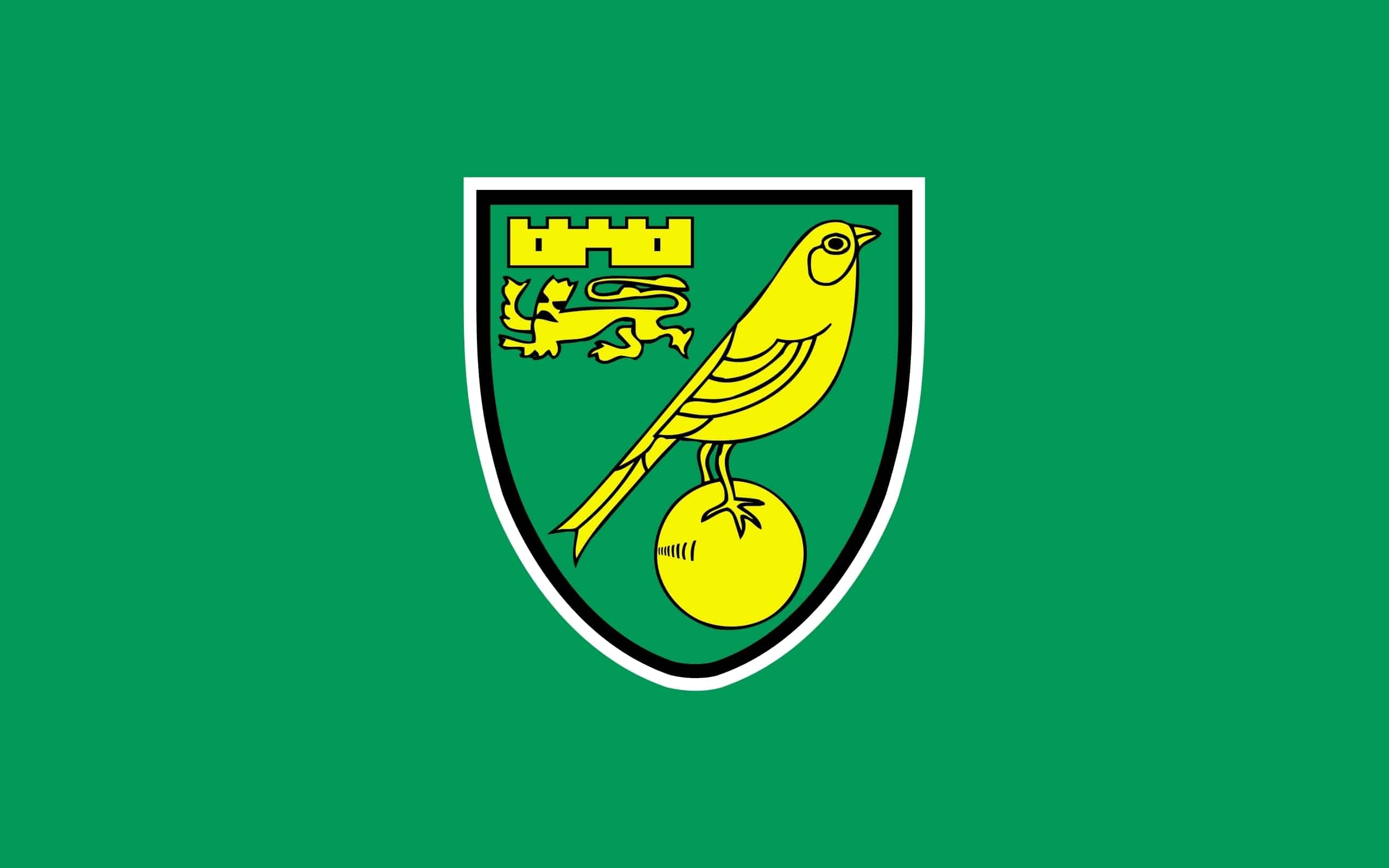
                Low key, but well executed, update from Norwich City

                https://twitter.com/norwichcityfc/status/1463205707369566214?s=21

                Comment


                  Various Artist will be spitting feathers over that. The old badge has been unchanged since the 70s.

                  Comment


                    I like it. It's subtle, the removal of the black outlines makes it look neater and the lion is now actually competently drawn.

                    I think it also bumps us up another place in the list of "oldest crests still in use".

                    Comment


                      Originally posted by Kevin S View Post
                      Various Artist will be spitting feathers over that. The old badge has been unchanged since the 70s.
                      Feathers, heh.

                      I'm... ambivalent. One of the small but real pleasures of supporting Norwich City for the last 33 (aargh!) years is that we've always had just about the most perfect club badge out there: distinctive, timeless, balanced, neither too busy nor too plain, unique colourscheme, you name it. Beautiful. And the club had not only never changed it in all that time, but hadn't since 1972. Given that it was however always going to happen eventually, especially in these few years when everyone and their dog is busy changing up their club crests to make them "digital ready" or whatever, this is probably about the best I could hope for. As UA and 3CR note, it is certainly a pretty low-key, subtle update as these things go.

                      It is frustratingly 'sterile' – but alas this was likely inevitable as it's very much a curse of the present sporting badge design paradigm: given that everyone is simultaneously trying to make their crests perform exactly the same way in the same digital arenas, the unfortunate upshot is that they're increasingly all coming out looking like they were designed by the same person. In this case I think it's a combination of the more stylised (as is the modern fashion) canary and the reduction of the colour palette to just the green and yellow, losing the black borders to the constituent elements that made it 'pop' a little more before.

                      Of course I understand why they've done it: the old design loses clarity when reduced, and they want it to be more obvious what's what when viewed on small screens and the like, presumably. Supposedly the visual contrast will be better now to make it more 'inclusive'. And at least all the same elements are still there in the same places, they've just been modernised:


                      The castle and lion are both arguably an improvement: the castle now resembles the actual Norwich Castle a little more, and the lion was always a bit, um... vague before, to say the least. They've been redrawn and sharpened up quite handsomely.

                      I can live with the redrawn canary, but the main annoyance is due to the fact that the designers simply couldn't live with the heretically off-centre placing of the ball in the classic design. Apparently that was a real bugbear of people at the club as it supposedly "unbalanced" the badge – yet for me having the ball slightly towards the lower-right actually balanced out the lion and castle at the upper-left.

                      And, crucially, it allowed room for the long tail of the canary. What they seem to have missed is that as a consequence of the redesign the bird itself now looks unbalanced: they've had to shorten its tail drastically, which coupled with the lack of visible leg joints (they now look like they're coming straight out from its bottom) means it doesn't seem like its centre of gravity would possibly keep it standing atop the ball. It looked legitimately perched there before, whereas now it appears like it's about to pivot and faceplant onto the end of its beak.

                      Notice too that on the old badge the angle of the legs and of the beak make it look like it's stretching slightly upwards, too, like it might take off any moment, or break into song: it adds a certain 'life' to it. Now, in contrast, it's very... stolid. It sort of just sits there flatly, heavily. The stumpy tail, stomach-jutting pose and duller expression makes it look undynamic, almost fat. Other fans have derisively compared it to a pigeon – at best, I think it resembles a sparrow.

                      But I guess I'll take it, considering what they might have done with the badge. I mean, my first instinct was "Oh! That's all right, actually". It's only when you compare it with the old one that the flaws really become apparent.
                      Last edited by Various Artist; 25-11-2021, 13:29.

                      Comment


                        An improvement in every respect. No longer looks like something from Bod.

                        Comment


                          That's a hugely impressive deconstruction, VA, and one which I'm largely in agreement with.

                          I'm also getting a slight Segway rider vibe from the new iteration.

                          Comment


                            Yes, was just going to post to applaud VA's essay myself - if only because it made me feel quite laidback about such issues by comparison when I'm anything but.

                            I take all of his points onboard about the redesign but I do think it's an improvement overall.

                            Comment


                              Just a brilliant piece of visual design criticism.

                              Bravo

                              Comment


                                Originally posted by Ray de Galles View Post
                                I take all of his points onboard about the redesign but I do think it's an improvement overall.
                                You took the words right out of my mouth (or off my fingers as the case may be).

                                I may have been projecting a bit for what I would want if our new Hollywood overlords decided it was time for a change. Keep the elements, the essence of the original but just tidy it up a bit. Get someone who can draw a bloody dragon, for a start.

                                Comment


                                  Funny you should say that about the dragon as VA's post made me think about how I've been instinctively against all of the Wales badge redesigns in my lifetime then realised relatively quickly that they were improvements:

                                  Comment


                                    Originally posted by Ray de Galles View Post
                                    all of the Wales badge redesigns in my lifetime
                                    Either you're a lot older than I thought, Ray, or else we're disregarding the first couple of badges there...! I'm slightly charmed by the gaily high-kicking dragon of a century ago, though I concede it also looks a bit like it's goose-stepping.

                                    Notable that the first version, bar the addition of the FAW initials, lasted 31 years; the 1951 version lasted 33, the 1984 update lasted another 26. The 2010 revamp lasted just 9.

                                    Comment


                                      Comment


                                        Thanks very much to NS, Ray and UA for some very kind words above, meanwhile – I really wasn't expecting that. Didn't mean to write quite so much, but I kept noticing more things as I typed.

                                        Originally posted by Nocturnal Submission View Post
                                        I'm also getting a slight Segway rider vibe from the new iteration.
                                        Oh shit. Yes, that's it. That perpetually forward-leaning, out-of-balance tilt, like a cartoon character running-with-spinning-legs, as if on the verge of falling flat on one's face if one stopped moving. You magnificent bastard, I'll never be able to unsee that from now on.


                                        As I say, it's basically fine, in isolation. That's frankly all because the layout was spot-on already and they haven't buggered around with it too much. I'll miss the hand-drawn 'warmth' of the original, though, it was sort of... friendly. This one is just a bit too clinical and impersonal to warm to immediately. I'll get used to it, I guess.

                                        It's mainly a pity that when compared directly with its predecessor the canary in particular has lost its elegance. The badge as a whole lacks that sense of lightness. Before, the overall design had a feeling of 'lift' upwards and rightwards – which, in terms of (Western) visual narrative, also says 'forwards'. Now, apart from making the bird somehow more earthbound, moving the ball to sit centrally at the base of the shield makes it all look more 'bottom-heavy'; it's sort of anchored down. Even sharpening the point at the base of the shield has made it look like it's pointing downwards. This is practically inviting the relegation jokes. Hell, even the lion is facing backwards now.
                                        Last edited by Various Artist; 27-11-2021, 23:25.

                                        Comment


                                          Originally posted by Various Artist View Post
                                          Either you're a lot older than I thought, Ray, or else we're disregarding the first couple of badges there...! I'm slightly charmed by the gaily high-kicking dragon of a century ago, though I concede it also looks a bit like it's goose-stepping.

                                          Notable that the first version, bar the addition of the FAW initials, lasted 31 years; the 1951 version lasted 33, the 1984 update lasted another 26. The 2010 revamp lasted just 9.
                                          Ha ha! I was born in 1968 so, yes, I'm only referring to the 1984, 2010 and 2019 redesigns. I did like that timeline of badges though so wanted to share it.

                                          The 2010 version is, on the face of it, just a bad bit of design and the 2019 simplification was called for. The fact that the former design is inextricably linked with The Greatest Month Of My Life made it's loss quite a wrench at the time but the new one is far better.

                                          Comment


                                            The timeline is so good that we posted it simultaneously.

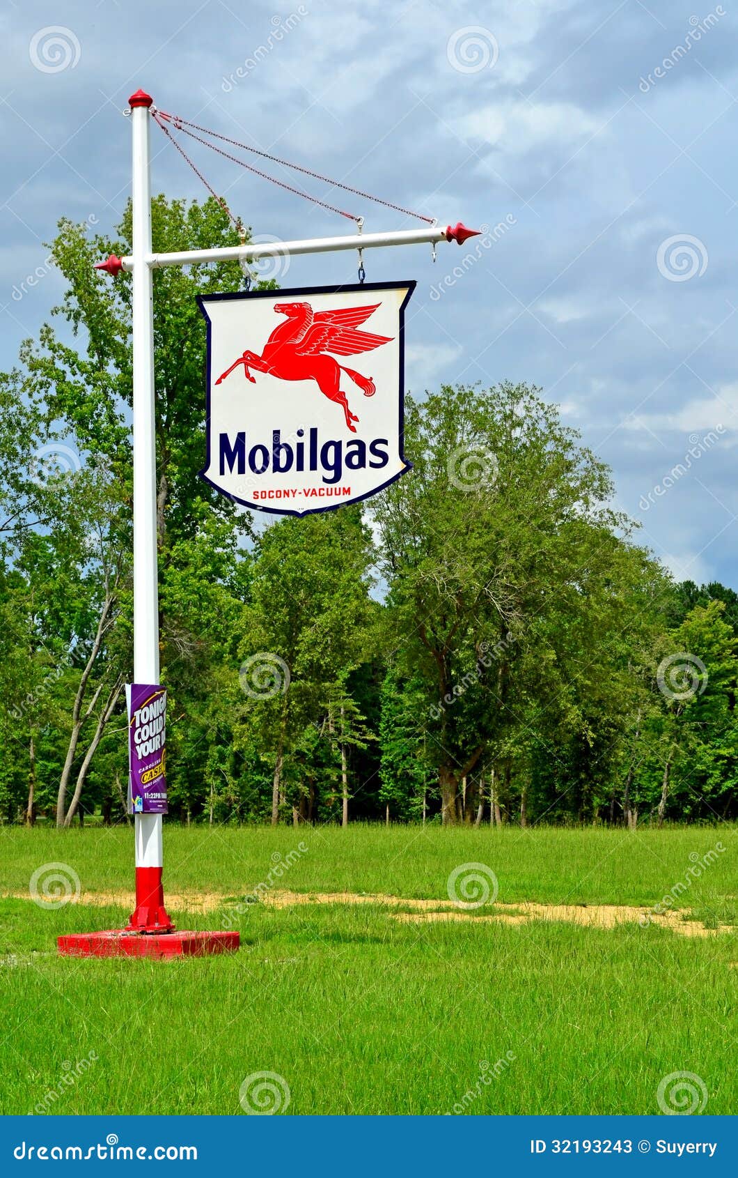
                                            The pre-War versions "read" to a USian as Pegasus.

                                            Or more specifically

                                            Comment


                                              Saint-Etienne have put up a poll about a new logo, it's unclear to me whether this is a permanent change or a commemorative one:

                                              https://instagram.com/asseofficiel?utm_medium=copy_link

                                              Comment


                                                It is intended to be a permanent (or at least not temporary) change.

                                                I am a bit surprised at hat has been been reported as massive support for the "shield" shape, but it isn't as if that is something the club hasn't used in the past.


                                                Comment


                                                  Originally posted by scratchmonkey View Post
                                                  Saint-Etienne have put up a poll about a new logo, it's unclear to me whether this is a permanent change or a commemorative one:

                                                  https://instagram.com/asseofficiel?utm_medium=copy_link
                                                  Quite like the look of option 2, less busy than the third choice, while the crown and swords in the first shield just jar for some reason.

                                                  Comment


                                                    It might be just me, but I do feel that in terms of broadening their appeal beyond Francophone markets, the sixth badge in that historical sequence above might've been the one to emulate in one key respect. Namely, it's the only one of the 8 that doesn't read ASS the moment you look at it.

                                                    Comment

                                                    Working...
                                                    X