
It looks weird. Like it's trying to be an optical illusion and the illusion is that it's not an optical illusion.
-
-
so do they not mind being called inter milan now?Originally posted by Ray de Galles View PostComment
-
I M NOT EVEN ABLE TO REMEMBER MY OWN FUCKING NAME PROPERLYComment
-
-
When I opened the thread I actually thought it was a new Marseille badge
It's not very good is it? When you compare it to the previous one it's amazing how much it loses visually by being completely symmetrical.Comment
-
Southall FC celebrate their 150th anniversary today with a tweaked badge, a roundel of course but certainly an improvement on their previous few designs :
https://twitter.com/fcsouthall/status/1377216274166648833?s=21

Comment
-
Those trees and rivers (I assume they're rivers) are still very Microsoft Paint.Comment
-
Nice to see Norwich's new retro badg...er, wait a minute?!
https://twitter.com/ollie_bayliss/status/1387761840986460163?s=21
Comment
-
You can barely see the difference.Comment
-
I think that's a big improvement. I don't have a lot of time for badges that are just bastardised versions of local heraldry. Not least because I think the average seven year old should be able to draw your badge, and they're going to make it a right mess of that old one.Comment
-
-
They have been "The Canaries" since the 1920s though?Comment
-
Yes but it appears from the club's blurb that they've only once had a canary on their shirts, very briefly, seventy years ago.
I may be wrong as that piece is torturously oblique, as is often the way with such things.Comment
-
[Groan] I don't much care TBH. I was p-o'd enough when they changed the strip to look like Norwich's quasi-little brothers (used to be gold and black, before that gold and blue.) Changing the badge to reinforce the idea doesn't surprise me at all. If they had to change anything it should be to magenta and white halved shirts and black shorts to match the original Hitchin team, which they insist in referencing regularly (see the new badge) even though it had nothing to do with the present club.Originally posted by Nocturnal Submission View PostComment
-
-
Hard pass
Comment
-
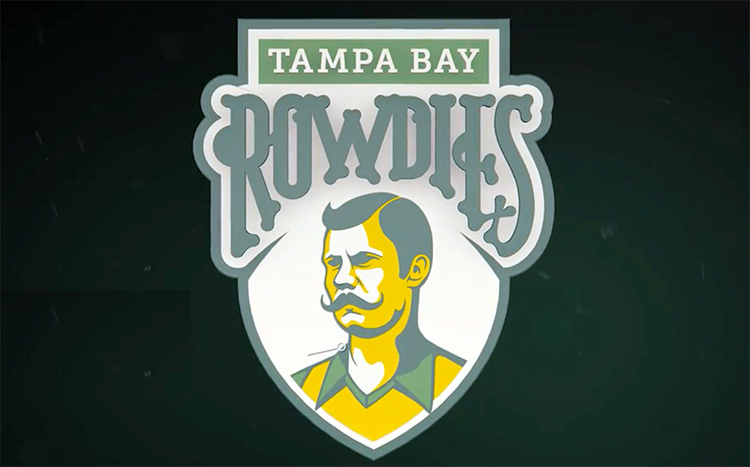
It honors the original Ralph Rowdie.Comment
-
It looks like a sign for a hipster barbers in Clerkenwell.Comment
-
Or Yuba City, I guess
I wouldn't give them my custom either
The grey is particularly ill consideredComment
-
That bloke doesn't look very rowdy.Comment
-
I'm getting a strong Simpsons vibe from it too.Comment
-
The slight 3D effect and shadow on the "ROWDIES" is unsettling. And Ralph looks like he's got a squint.Comment
-
Everything about that is wrong. And the lapels coming out over the border manages to emphasise all the other badness..Comment
-
How long has "wordmark" been ⏃ word?Comment
Comment