Announcement

Collapse
No announcement yet.

World Cup Poster

Collapse
X
 
  • Filter
  • Time
  • Show
Clear All
new posts

    World Cup Poster


    I've seen worse.

    #2
    I presume that the "official" version will shed the sponsors' logos, as was the case in Brazil.

    Comment


      #3
      I like that. Don't we have a Posters thread on World, I saw a great one today.

      Comment


        #4
        If you're going to be picky, surely this thread should be in the World Cup 2018 forum...

        Comment


          #5

          Comment


            #6
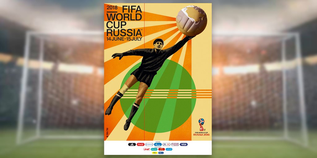
            The official poster is superb. There is nothing about it I don't like. It's the best since Mexico 86, and the first since 1978 to feature as football-playing person.

            I still think the 1974 poster is the best: artistically and in its energy, plus that stark black background.

            Comment


              #7
              It's a good'un- although as Russia practically invented graphic desigm you'd hope it would be.

              I also like the one at the top with the goalkeeper, ahaha

              Comment


                #8
                Fookin 'ell, Putin's got to OTF. It's shit. It looks like the keeper's got an invisible Subbuteto handle up his arse, suspended in mid-air with a chronic bout of constipation. Presumably the bandage on his right knee is from when ex-KGB henchmen 'persuaded' him to pose for the shot. I seem to be a mysterious lone voice about this, though - slobbering praise all over Twitter too for this appropriately abortive depiction. True, I'd like the 1960s typeface, if this was indeed the 1960s.

                Comment


                  #9
                  Its a good poster, inp

                  Comment


                    #10
                    It looks like a schoolchild's update of the 1930 design.

                    Comment


                      #11
                      This one for me - first World Cup i can remember and it has such an iconic font. Also the first use of the Adidas Telstar ball.

                      Last edited by Vicarious Thrillseeker; 29-11-2017, 07:53.

                      Comment


                        #12
                        It's too polished for the style it's knocking off. Everything is shaded or a gradient. There don't seem to be any actual blocks of colours.

                        Comment


                          #13
                          Just because they called him The Black Spider doesn't mean you have to make his limbs look that spindly.

                          Comment


                            #14
                            G-Man speaks for me on the subject of the 1974 poster.

                            Comment


                              #15
                              Although the foreshortening of the kicking leg troubles me more than somewhat.

                              Comment


                                #16
                                Now that you mention it TG, that is problematic.

                                The Russian effort - Lev Yashin is hoist into orbit, his hand affixed to a badly painted Sputnik. Subtle hints of Terry Gilliam.

                                Comment


                                  #17
                                  Originally posted by 3 Colours Red View Post
                                  Just because they called him The Black Spider doesn't mean you have to make his limbs look that spindly.
                                  To be fair, Yashin's legs weren't exactly like Gerd Müller's.

                                  Comment


                                    #18
                                    Well, yeah - they wouldn't have given him the nickname if he was even slightly dumpy... but they've made him look like Ian Ormondroyd.

                                    Comment


                                      #19
                                      It's beginning to make sense - Yashin, with his bandaged knee, represents the damaged Russian state, desperately trying to hold on to an era when everything was centrally controlled. But you can see from Yashin's face it's a hopeless task. The world is too big for Russia to control and manipulate, and even when trying to keep its hands clean by wearing thick black gloves, everyone knows that Putin's dirty fingers are all over this disastrous and ultimately doomed project. The rays of sunshine coming from the outside world serve to expose Russia's state-sanctioned doping programme. Lev's face says it all - "We're cheats, and bugger it, we've been caught."

                                      Still think it looks terrible. Probably designed my Mutkin's nephew for a couple of million.

                                      Comment


                                        #20
                                        Art criticism at its finest. Thanks, imp.

                                        Comment

                                        Working...
                                        X