Announcement

Collapse
No announcement yet.

The Shirt Locker - Kit Gallery 2015/16

Collapse
X
 
  • Filter
  • Time
  • Show
Clear All
new posts

    The Shirt Locker - Kit Gallery 2015/16

    Been thinking we need a kit thread for next season and UA's Juve monstrosity has prompted me to start it.

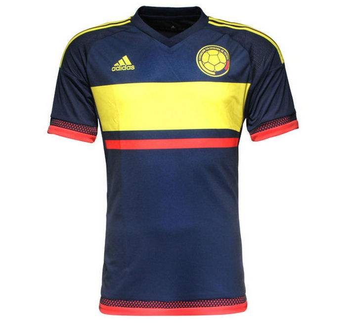
    This Colombia Copa America change shirt is going to be hard to beat:


    .

    #2
    The Shirt Locker - Kit Gallery 2015/16

    Staying with Colombia - they've reverted to their full proper colours for their first kit, huzzah!:


    The shirt is allegedly "cycling inspired" too which seems to be a growing theme.

    Comment


      #3
      The Shirt Locker - Kit Gallery 2015/16

      Harry Truscott wrote:
      The shirt is allegedly "cycling inspired" too which seems to be a growing theme.
      Wot, lots of pockets for yer little bottles of pills?

      Comment


        #4
        The Shirt Locker - Kit Gallery 2015/16

        That does look smart.

        One of the reasons International football is aesthetically pleasing (to me) is the absence of shirt advertising.

        I get that there's plenty of it elsewhere, but at least not on the kit. Other than the manufacturer.

        At least at this level.

        Comment


          #5
          The Shirt Locker - Kit Gallery 2015/16

          The Colombia away is lush, but is really let down by the recoloured badge. The orange ball has always been a key part of their identity for me.

          Comment


            #6
            The Shirt Locker - Kit Gallery 2015/16

            "away"?! Grrrrrrrrrrr, et tu ursus?

            I hadn't registered the recolouring of the badge, that severely dents it for me too.

            .

            Comment


              #7
              The Shirt Locker - Kit Gallery 2015/16

              OK, change.

              Though I doubt they are going to wear it much at home.

              Do we know what colour the shorts are? They pose the same issue with the badge, though keeping it orange on the shorts would be even worse in some ways.

              Comment


                #8
                The Shirt Locker - Kit Gallery 2015/16

                Well, the entire concept of "home" and "away" are largely redundant for a tournament finals anyway.

                No, can't find any info on or pics of the shorts anywhere.

                Comment


                  #9
                  The Shirt Locker - Kit Gallery 2015/16

                  Yes, though I presume that the kits are going to be used for more than just the tournament, though Colombia don't appear to have announced any post-Chile friendlies.

                  They usually play at least one game in the US (either near NYC or in Miami).

                  Comment


                    #10
                    The Shirt Locker - Kit Gallery 2015/16

                    The Netherlands shirt popping up in the old thread reminded me about seeing this earlier, Portugal's new change shirt ;


                    Ronaldo emphasising it's and his subtlety in the promo photo ;


                    .

                    Comment


                      #11
                      The Shirt Locker - Kit Gallery 2015/16

                      Rumour has it:


                      Comment


                        #12
                        The Shirt Locker - Kit Gallery 2015/16

                        I like the 1st and 3rd kits, but that change shirt looks like something rejected by Rangers or Holland as being too cliche even for them.

                        Comment


                          #13
                          The Shirt Locker - Kit Gallery 2015/16

                          I know at least one Chelsea fan who wouldn't wear any of them because of the bits of red. Yes, I'm even counting the sponsor's logo in that.

                          Comment


                            #14
                            The Shirt Locker - Kit Gallery 2015/16

                            The roses on Chelsea's badge have been red since at least the 50s.

                            Comment


                              #15
                              The Shirt Locker - Kit Gallery 2015/16

                              Try telling him that - he also seems to have forgotten the fact that red was a regular accent colour on the 80s and 90s strips.

                              Comment


                                #16
                                The Shirt Locker - Kit Gallery 2015/16

                                I do hope that he stays away from the Pensioners.

                                Some of them are quite frail.

                                Comment


                                  #17
                                  The Shirt Locker - Kit Gallery 2015/16

                                  Good thing there aren't too many of them in Wrexham, really.

                                  I believe the anti-red thing stems from his hatred of Arsenal and Man U.

                                  Comment


                                    #18
                                    The Shirt Locker - Kit Gallery 2015/16

                                    I'm not crazy about the new sponsor's logo but I can live with it and the red trim doesn't look unattractive, certainly when compared to this monstrosity, which nevertheless currently resides in one of my drawers:

                                    Comment


                                      #19
                                      The Shirt Locker - Kit Gallery 2015/16

                                      [quote=Three Times A Reddy post=1029854]Good thing there aren't too many of them in Wrexham, really.

                                      For some reason there's a fair few Chelsea fans in Conwy. And not the Johnny Come Lately PL/CL winner types either, think a lot of it dates back to the 1970 FA Cup final. My brother is a Chelsea fan, and there are way more Blues fans than say, Arsenal or Spurs. It's a bit odd...although until recently there always was a north Wales link with Eddie N, Mickey Thomas, Joey Joneson the playing side and Gwyn Williams behind the scenes

                                      Comment


                                        #20
                                        The Shirt Locker - Kit Gallery 2015/16

                                        I think history has taught us not to expend too much time and energy on rumoured kits given the amount of mocked up fakes around.

                                        Comment


                                          #21
                                          The Shirt Locker - Kit Gallery 2015/16

                                          Norway; the gradients have to be stopped, and I have no clue why the socks are darker.

                                          Comment


                                            #22
                                            The Shirt Locker - Kit Gallery 2015/16

                                            Nocturnal Submission wrote: I'm not crazy about the new sponsor's logo but I can live with it and the red trim doesn't look unattractive, certainly when compared to this monstrosity, which nevertheless currently resides in one of my drawers:

                                            That's actually a beautiful piece of 90's design.

                                            Comment


                                              #23
                                              The Shirt Locker - Kit Gallery 2015/16

                                              The Norway socks have often been navy, haven't they? It's the sash's variable colour that is throwing the whole look off.

                                              Comment


                                                #24
                                                The Shirt Locker - Kit Gallery 2015/16

                                                Yes, I think that is the source of the problem, though they also have to deal with the fact that their latest badge seems to use a lighter shade of blue than their actual flag.

                                                Comment


                                                  #25
                                                  The Shirt Locker - Kit Gallery 2015/16

                                                  Nocturnal Submission wrote: I'm not crazy about the new sponsor's logo but I can live with it and the red trim doesn't look unattractive, certainly when compared to this monstrosity, which nevertheless currently resides in one of my drawers:

                                                  From the club that approved this design …

                                                  Comment

                                                  Working...
                                                  X