Announcement

Collapse
No announcement yet.

Strip Search - Kit Gallery 22/23

Collapse
X
 
  • Filter
  • Time
  • Show
Clear All
new posts


    Looks like the delighted audience during the magician's spot at a children's birthday party.

    Comment


      Just catching up with a dozen pages of this thread - there are some really nice shirts in Scotland this season: Aberdeen, Hearts, Hibs, Motherwell, Dundee. And I share the view of whoever it was said they'd loved the Dunfermline badge ever since the Esso badge collection 50 years ago. That piece of memorabilia was the most visually educative football item a kid could wish to own and I used to pore over it for hours, running my fingers over the metallic emblems (still got it somewhere).

      I also like the Italian one, and the West Ham one too, but that can be explained by the fact I was one of the few people alive who liked the RB Leipzig away shirt last season.

      I haven't bothered posting Eintracht's white Nike home kit because it doesn't deserve the effort. Also share RobW's view on the new Lincoln home kit - just a poor version of an old Southampton shirt. Plus, I'm disappointed that sponsor Branston is neither the pickle, nor a collective sponsorship by the Lincolnshire village of the same name.

      Comment


        Plymouth - gorgeous. Not usually the biggest fan of diagonal stripes (or maybe it was just Palace's last season I wasn't keen on) but that's got just enough going on without being too busy.

        Southampton - too much white.

        Coventry - I'd be pulling that face too.

        Bolton - is the player trying to replicate the cheesy grin of the sponsor logo? Still one of the better Macron efforts though, which makes me slightly less fearful for the moment when we become the last team on Earth to launch ours.

        Partick - still trying to capitalise on the Kingsley hysteria of 2015?

        PSG - couldn't have happened to a nicer club.

        Comment


          No news on the Palace home shirt, but alarmingly, it's been pointed out that Macron did Hajduk Split last year in red and blue 'scribble' stripes like those used on the unveiled away kit (where I can just about stand it)

          Comment


            Plymouth's home is very, very nice:

            Comment


              That is lovely and shows you can do images well.

              Count me as a fan of both Argyle kits.
              The change kit reminds me a touch of this Basque national shirt that Ray got me.

              Attached Files

              Comment


                The kits on this thread from the Southampton shirt up to the PSG one is horrid. Plymouth rescuing the thread it seems.

                Comment


                  Ohhh, we've so got it right this year.

                  To bring standards down a bit, meet our 3rd shirt which I'm hereby naming the TV interference shirt. We'll probably wear it the once somewhere up north and it'll never be heard from again.

                  Comment


                    Originally posted by Nesta View Post
                    No news on the Palace home shirt, but alarmingly, it's been pointed out that Macron did Hajduk Split last year in red and blue 'scribble' stripes like those used on the unveiled away kit (where I can just about stand it)
                    Just spotted your new favourite team Nesta. As you've no doubt been taking a keen interest in the Bastards' performances in the Catforth Summer League you must have been as shocked as I was to discover that the 2-1 win against JD Blackpool South which I reported on is now showing as a 0-3 defeat. Fielded an illegitimate player I imagine.

                    Comment


                      First orders of the new NUFC home shirt are being dispatched, and Castore have managed to fuck up and ship out loads without the sponsor on the front.

                      Quite a few of the purchasers are unhappy about this.

                      Comment


                        Was just thinking Pilgrims would need an alternative change since both the first and change kits have white sleeves.

                        Comment


                          Ah, the new Bolton kit has been posted. Which means it's once again the time of year for me to lament that back in the days of OTF Gold, this thread would just be a slow buildup to whatever utterly hilarious monstrosity Reebok were making them wear this time. I miss those days.

                          Don't get me wrong, that new one's not nice, not by a long shot. But it's not anywhere near as bad (and therefore amazing) as the shit they used to have to wear.

                          Comment


                            Comment


                              I'm hoping that's a spoof, as the bit surrounding the sponsors' logo doesn't match the teaser the club put out. But equally, it wouldn't suprorise me if it was real as the club seems entirely obsessed with fucking Kingsley (an unfunny joke that's now 5 years past its sell-by date).

                              Comment


                                Comment


                                  If the Joma and Lotus logos were green, that would have been perfect.

                                  But Joma gonna Joma - the Spanish Macron.

                                  Comment


                                    Originally posted by Hot Orange View Post
                                    I like that a lot

                                    Comment


                                      Originally posted by 3 Colours Red View Post
                                      If the Joma and Lotus logos were green, that would have been perfect.

                                      But Joma gonna Joma - the Spanish Macron.
                                      Could have been worse – the sponsor on the 1984 kit this is obviously inspired by was red.

                                      Comment


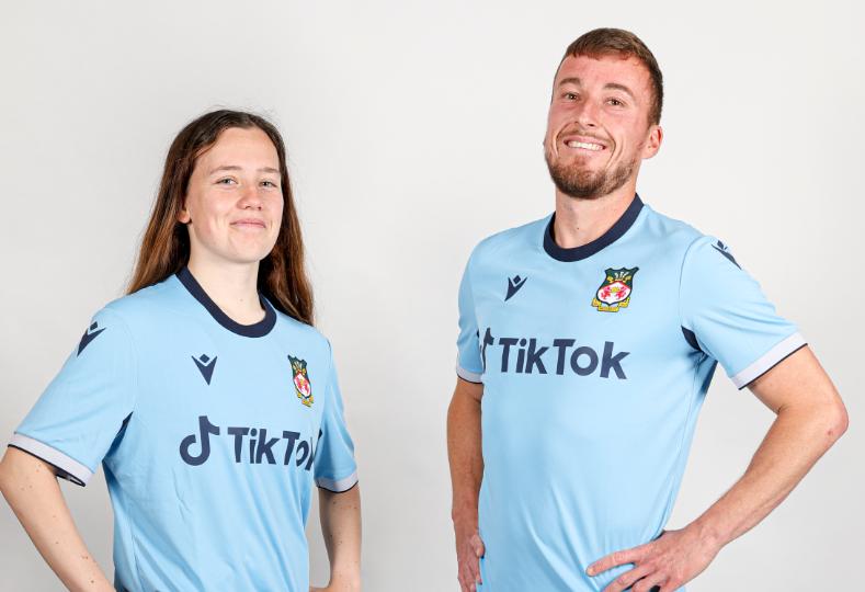
                                        We've unveiled our change kit. It's fine, I suppose - thank heaven for small mercies and all that. The mismatching collar and cuffs rankle but... y'know, Macron.

                                        Just give us this in red for the first shirt (AND RED SOCKS!!!!!!!!!!!!) and I would be not too dissatisfied.

                                        Comment


                                          BE376AC0-2712-431A-9767-9A373801AFF3.thumb.jpeg.7a61e87ed00fc223ea52118faabeff94.jpg

                                          Comment


                                            Originally posted by beak View Post
                                            First orders of the new NUFC home shirt are being dispatched, and Castore have managed to fuck up and ship out loads without the sponsor on the front.

                                            Quite a few of the purchasers are unhappy about this.
                                            Why, unless they work for the sponsors' marketing department? Surely nobody actually likes their club's shirts being defaced with adverts?

                                            Comment


                                              Because they don't look like the match shirts?

                                              (And yes, I do like sponsored shirts. They are part of the design and it looks unfinished without one.)

                                              Comment


                                                I'm the same, which is also why I wouldn't buy an Ireland shirt for years, because they had a sponsor on it, when the match worn shirts didn't.

                                                Comment


                                                  That's interesting. I never imagined anyone would like having the sponsor on the shirt. One of the reasons I never buy football shirts is the fact that you can;t get one without a sponsor on

                                                  Comment


                                                    When Southampton were sponsored by the entirely fictional LD Sports a couple of seasons ago, we were lucky enough to have Under Armour as the kit manufacturer which meant the garment was so poorly made you could easily peel the logo off after a warm wash cycle.

                                                    Comment

                                                    Working...
                                                    X