Announcement

Collapse
No announcement yet.

Postponed Polyester? 20/21 (or maybe just '21) Kit Gallery

Collapse
X
 
  • Filter
  • Time
  • Show
Clear All
new posts

    Originally posted by Ray de Galles View Post
    Blackpool's kit is a so-so Puma template job but they have possibly the best sponsor's logo (aesthetically and thematically) yet :

    https://twitter.com/blackpoolfc/status/1285180029958225921?s=21

    Though I wasn't aware they had abandoned tangerine to be back in it.
    I love the sponsor's logo too.

    I've been imagining what images Barnsley could have if we had the same idea. I think a charity shop and someone fly tipping would just about be right.

    Comment


      Originally posted by Billy Casper View Post

      I've been imagining what images Barnsley could have if we had the same idea. I think a charity shop and someone fly tipping would just about be right.
      We could have that too. In fact, lots of clubs could have that. It'd be more rampant than 32Red.

      Comment


        https://twitter.com/scullionoflarne/status/1298976350225567745

        Comment


          I’m not sure why he’s surprised. It happens every single year multiple times.

          Comment


            Originally posted by ursus arctos View Post
            Juventus third

            That is shit. It looks like the kind of thing left on the sportswear rack in TK Maxx.

            Comment


              Originally posted by Jumbo McGinnis View Post
              I’m not sure why he’s surprised. It happens every single year multiple times.
              Templates, of course, but I think the absolutely identical execution of the sponsor makes it notable

              Comment


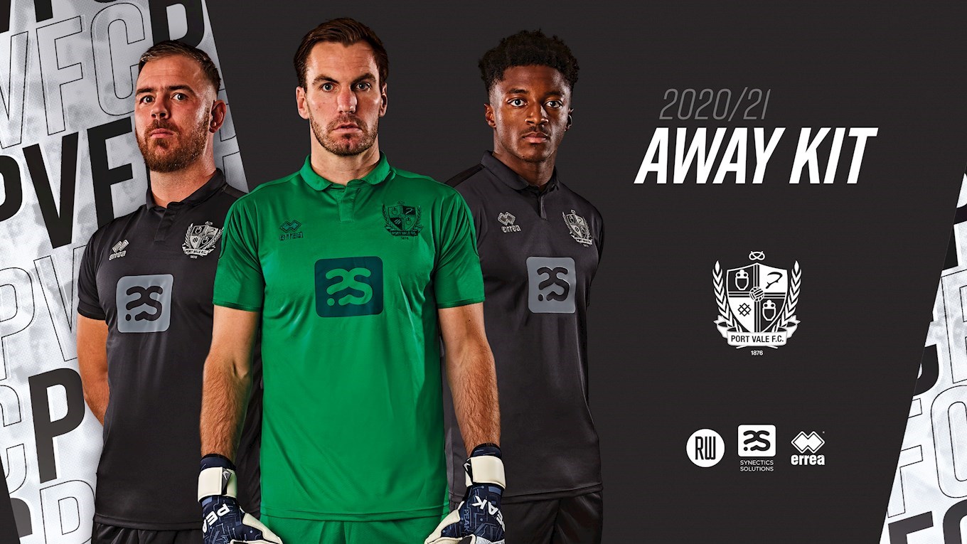
                Anybody like me who was hoping Port Vale would really go to town for their change shirt is in for a let down:

                Comment


                  What are Port Vale going to wear when they play away at Grimsby?

                  Comment


                    Japan away. Apparently there is a cloud image in the white somewhere. I guess they used up all the colour and pattern on the home kit. When did shirts start to be officially presented as being untucked? Wasn't there a whole period where baggy socks and untucked shirts could get you a booking or something?

                    Comment


                      The new Wycombe home kit is giving me a bit of a headache. The new Keeper change on the other hand...

                      Comment


                        Is that Wycombe Wanderers away goalkeeper shirt a deliberate homage to Mardi Gras?

                        Comment


                          Good spot, the press release does refer to it as being "in Mardi Gras colours of purple, green and yellow".

                          Comment


                            Were they intending the point where the quarters meet to look like a QR code?

                            Comment


                              Does Wycombe celebrate Mardi Gras?

                              Comment


                                If they do, Howard Jones will be providing the music.

                                Comment


                                  Originally posted by Amor de Cosmos View Post
                                  Does Wycombe celebrate Mardi Gras?
                                  I've never noticed it. Unless they translated the two words separately on google.

                                  Comment


                                    It seems Wolves couldn't decide between three different options for their new away kit... so just mashed them all together.

                                    For once the hard work of ruining a shirt has been done, before slapping ManBet's logo(s) on it.

                                    Comment


                                      Please...please...just...just...make it stop! ;

                                      https://twitter.com/classicshirts/status/1299264377389027329?s=21


                                      Edit : It really is terrifying the amount of time Uros and I go to post kits in exactly the same minute.
                                      Last edited by Ray de Galles; 28-08-2020, 10:32.

                                      Comment


                                        Man City paisley third shirt confirmed ;


                                        https://twitter.com/mancity/status/1299044242438991872?s=21

                                        Comment


                                          I'm glad Yeovil have dropped the naff Celtic tribute kit after all these years but unsure about this text-covered oddity :

                                          https://twitter.com/ytfc/status/1298953416559849478?s=21

                                          Comment


                                            Originally posted by lambers View Post
                                            Good spot, the press release does refer to it as being "in Mardi Gras colours of purple, green and yellow".
                                            Shit! I was joking.

                                            But to be honest, I'm all for it, and would like to see more clubs from provincial towns acknowledging pre-lent celebrations in their kits. A Stevenage third kit honouring Ecuador's Festival of Flowers and Fruits; the Rio Carnival evoked in a Reading away shirt, complete with feathered wings on the 'keeper top; or a complex Aldershot change shirt that pays tribute to Fasching. Your move kit manufacturers.

                                            Comment


                                              Hmmm.

                                              I don't mind the Wycombe shirt especially as the back is quartered too.

                                              That Wolves change shirt looks like a photoshop effort by a primary school kid.

                                              Man City are just trying to be unlikeable now. Pink and paisley? Come on. That's just yob colours.

                                              The Yeovil strip is just terrible.

                                              Comment


                                                Originally posted by 3 Colours Red View Post
                                                Were they intending the point where the quarters meet to look like a QR code?
                                                Whilst it may look like a QR code, I can confirm that it is, in fact, not one.

                                                Yes, I did check.

                                                Comment


                                                  At least you wouldn't have to worry about ruining that Wolves shirt if you were a painter and decorator.

                                                  Comment


                                                    It looks like Bob Ross approximately five seconds into "The Joy of Painting".

                                                    Comment

                                                    Working...
                                                    X