Announcement

Collapse
No announcement yet.

Touching From A Distance - Deborah Curtis

Collapse
X
 
  • Filter
  • Time
  • Show
Clear All
new posts

    Touching From A Distance - Deborah Curtis

    I read this last week and thought it was excellent. She gives a plausible explanation of his personality and the inevitability of his demise.

    The band members do not emerge with much credit, as they seem (even now) to think that Curtis was willing to do the American tour and that his suicide occurred during a period when he had seemed to be doing relatively OK by his standards. This book shows I think convincingly that he had no intention of going to the US and was infact putting up a front to his bandmates.

    #2
    Touching From A Distance - Deborah Curtis

    Just saw this. I read this when it first came out, pre books on the Internet days. I had to go downtown Toronto, fill out a bit of paper, pay my money, and about four months later got a phone call that it had come in. Trek back downtown to pick it up. Fawwwwwwk.

    Great book. And I went to the movie premiere of the 'movie of the book' and got Sam whatsisnane's autograph, who played Curtis. Anton Corbijn was there for a Q&A, but he's not a lot of laughs.

    Comment


      #3
      Touching From A Distance - Deborah Curtis

      Samantha Morton, one of the best actresses of her generation.

      Comment


        #4
        Touching From A Distance - Deborah Curtis

        WOM may have meant Sam Riley, who played Ian C.

        I haven't read the book for years but remember it as well told and very sad. Peter Hook's Unknown Pleasures book is a good read and doesn't duck admitting that the rest of the band to some degree chose not to see what was happening in front of them. Bernard Sumner's memoir, out later this month, should be very entertaining if it manages to capture his voice.

        Comment


          #5
          Touching From A Distance - Deborah Curtis

          Oh, of course, Sam Riley. He is excellent too.

          Deborah Curtis in thread title, her book. Plus I have a Sam Morton close connection who calls her Sam.

          Comment


            #6
            Touching From A Distance - Deborah Curtis

            Yes, Riley is who I meant. Dope that I am, I didn't get Alexandra Lara's (Annik) autograph, too. She was standing right beside him, and they're now married. She was in that clip from Der Untergang/Downfall that's turned into the infamous internet meme.

            Comment


              #7
              Touching From A Distance - Deborah Curtis

              It's been on my reading list for some time, but the details of Curtis' short life have been splattered across various media for years. It seems like we hear the same stories again and again.

              Does she open up about her own feelings in the book?

              Comment


                #8
                Touching From A Distance - Deborah Curtis

                I couldn’t get on with Control at all. Sam Harris was far too pretty to be Curtis and had all the gravitas of a lead singer of a landfill indie band, which of course……Sean Harris’s briefish depiction of Curtis in 24 Hour Party People was far superior, capturing both the man’s visceral temperament and his vulnerabilities.

                Another thing I didn’t like about Control was its black and white cinematography. Everything we know about about Ian Curtis is monochrome, from the front covers of Unknown Pleasures and Closer to (ironically enough), Corbijn’s famous photos of the band in late 1970’s Manchester. Popular memory of Curtis is Black, White and Grey. A braver film would have been in colour. All the film did for me despite taking its inspiration from Deborah Curtis’s (excellent) autobiography, was to cement and freeze the myth of Curtis rather than attempt to portray him as the flawed human being he was.

                The whole point of the book was to counter the myth of Curtis but Corbijn's film ignores this, indulging too much in self-referencing and self mythology having been there “at the time”. Corbijn did much to create the myth of Curtis and his band through his photography, his film didn't do much to counter it.

                Comment


                  #9
                  Touching From A Distance - Deborah Curtis

                  Those are interesting and valid criticisms, but I loved the film.

                  I seem to recall Kevin Cummins being asked why there were no colour pics of Joy Division. He said Curtis was a funny (haha) bloke but they had to go with glum looks and monochrome? Will see if I can find an interview online but it may have been a talk I attended at St Martins.

                  Edit: here's an interview with the Telegraph, which is interesting, though it doesn't quite chime with what I remember him saying (but my memory could be at fault).

                  http://www.telegraph.co.uk/culture/photography/10882054/Kevin-Cummins-QandA-I-saved-Joy-Division-from-being-Bon-Jovi.html

                  I haven't read the Deborah Curtis book yet, will do so soon.

                  Comment


                    #10
                    Touching From A Distance - Deborah Curtis

                    Yeah, Kevin Cummins did the best-known JD shots didn't he? I know Corbijn did the (posthumous) video for 'Atmosphere' but as a photographer I associate him more with U2 in the late 80s, around the time that video was made.

                    I'd always assumed they used black and white because the music press was mostly printed in black and white. Unless they got on TOTP or MTV, most bands from the time existed in black and white. Not that colour would add much to, say, The Birthday Party's image, except perhaps an element of realist body horror.

                    Biopics, especially those about musicians, rarely come off well and usually sail close to sentimental TV movie territory, I think. They get a short-term round of applause - people think it's amazing when actors do impressions of figures they already recognise - but get quickly forgotten. I doubt many people have watched Walk The Line twice, you know?

                    I thought Closer did it better than most by having a coherent style and understated acting, but it's hard to shake the limits of the story and the genre really. Not that much happened, Curtis, died very young, and the band stopped there.

                    Live music and the quirks of musicians' performances aren't easy to recreate; brief glimpses and cameos (as in 24 Hour Party People) usually work best. If your subject is a whole scene and 15 years or so you can keep the energy up.

                    Comment


                      #11
                      Touching From A Distance - Deborah Curtis

                      WOM wrote: Just saw this. I read this when it first came out, pre books on the Internet days. I had to go downtown Toronto, fill out a bit of paper, pay my money, and about four months later got a phone call that it had come in. Trek back downtown to pick it up. Fawwwwwwk..
                      Part of me misses that experience. I did it last with, I think, a Hungarian cookbook for the wife.

                      Comment


                        #12
                        Touching From A Distance - Deborah Curtis

                        I thought the subplot of the wife's POV, fame going to his head and the eager groupie appearing on the scene (no doubt her POV is different) very well done, painfully so.

                        Comment


                          #13
                          Touching From A Distance - Deborah Curtis

                          Lucia Lanigan wrote:

                          I'd always assumed they used black and white because the music press was mostly printed in black and white. Unless they got on TOTP or MTV, most bands from the time existed in black and white.
                          That was one of the main reasons. B&W album covers are indelibly linked to the late '70s and '80s.

                          There was a thread on this a few years ago.

                          http://www.wsc.co.uk/forum-index/29-...w-album-covers

                          Comment


                            #14
                            Touching From A Distance - Deborah Curtis

                            Land Waster wrote:
                            Originally posted by Lucia Lanigan

                            I'd always assumed they used black and white because the music press was mostly printed in black and white. Unless they got on TOTP or MTV, most bands from the time existed in black and white.
                            That was one of the main reasons. B&W album covers are indelibly linked to the late '70s and '80s.

                            There was a thread on this a few years ago.

                            http://www.wsc.co.uk/forum-index/29-...w-album-covers
                            The music press was (even more) mostly printed in black and white in the 60s, but album covers were almost always in full, and often very garish, colour. The stripped down 70s aesthetic was largely a reaction against that.

                            Comment


                              #15
                              Touching From A Distance - Deborah Curtis

                              I stopped reading this book a few chapters in. I don't recall what I didn't like about it. Perhaps it was just that she seemed really bitter - understandably - and I didn't want to go through that, or maybe I was unfairly inferring that. Perhaps I'll pick up Hook and Sumner's book too. Having three different perspectives makes each of them more useful, I think.

                              Come to think of it, I recall trying to read her book while waiting at the Maryland DMV. Perhaps the combination was just more bleakness than I could handle.

                              I like Control, but it is just kind of a long music video (but without enough music, I thought). I felt like 24 Hour Party People did a better job. Or maybe it was just that 24HPP focused more on the aspects of the story I'm interested in whereas Control was more about Deborah Curtis.

                              A while back, Wingco made the comment that Control would have been better in color because then we could see how this remarkable black-and-gray sound emerged from a world of brown and orange shag carpet, avocado green and harvest gold kitchens, and flair trousers. Or something along those lines.

                              As with Bauhaus and a few others, I just can't quite imagine how Joy Division's sound emerged from the 1970s. I'm very glad that it did, but it's just so at odds with my, albeit faint, memories of what everything looked and sounded like back then.

                              Comment


                                #16
                                Touching From A Distance - Deborah Curtis

                                On the black and white picture question, a photographer friend of mine explained to me that it's simply a lot easier for artists to do stuff in the developing studio with black and white film than with color and that's why almost all "artsy" photography is black and white.

                                But now almost all photos are digital and anything can be made to look like anything and anyone with a smartphone - which is lots and lots of people - has the power to quickly manipulate color pictures in ways that only experts working in expensive labs could not that long ago.

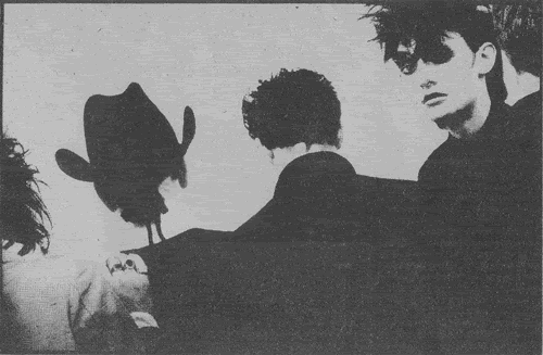
                                I'd like to know where we got the convention - cliche, really - of everyone in the band looking in different directions (nobody smiling, of course) and/or some members standing far away.

                                Comment


                                  #17
                                  Touching From A Distance - Deborah Curtis

                                  Amor de Cosmos wrote:
                                  Originally posted by Land Waster
                                  Originally posted by Lucia Lanigan
                                  I'd always assumed they used black and white because the music press was mostly printed in black and white. Unless they got on TOTP or MTV, most bands from the time existed in black and white.
                                  That was one of the main reasons. B&W album covers are indelibly linked to the late '70s and '80s.
                                  There was a thread on this a few years ago.
                                  http://www.wsc.co.uk/forum-index/29-...w-album-covers
                                  The music press was (even more) mostly printed in black and white in the 60s, but album covers were almost always in full, and often very garish, colour. The stripped down 70s aesthetic was largely a reaction against that.
                                  The B&W covers were more 80s than 70s on the whole, I think.

                                  I was thinking specifically about the “iconic”, if you will, photos of Joy Division up there, which were taken for NME features rather than their record sleeves. The thing with the latter was: the band didn't appear on them. They were built from images and typography that caught Peter Saville's fancy (before he'd heard the record in Closer's case, I think I'm right in saying).

                                  Punk obviously had a raw, Xerox-y aesthetic, borne initially of necessity. But the sleeves were often garishly colourful and band-free, like Never Mind The Bollocks or Buzzcocks' 'Orgasm Addict'.


                                  On the other hand, the first Clash album was probably the template for a lot of band shots on record sleeves: stark urban scenes with radical leg angles. So, you know, “it's complicated” as they say on Facebook when they're pretending to have an exciting love life rather than a Match.com account.


                                  Post punk was a sophisticated free-for-all design-wise, though: different again. The cover for Joy Division's 'Transmission' could be a Tangerine Dream one if it bore the name of a Greek goddess in bubble lettering:


                                  Peter Saville was a massive Roxy Music fan, and I think that gave him a taste for lifting dead cool and classy images and fonts from all quarters, which worked a treat on the whole.

                                  Look at this vile thing, though, as far removed from the post-punk aesthetics as you could get:


                                  You'd think it was a rank LA metal album from that sleeve. But it was for the best album by these nihilistic scamps:


                                  (Another Cummins shot, that.)

                                  Comment


                                    #18
                                    Touching From A Distance - Deborah Curtis

                                    The B&W covers were more 80s than 70s on the whole, I think.

                                    I was thinking specifically about the “iconic”, if you will, photos of Joy Division up there, which were taken for NME features rather than their record sleeves. The thing with the latter was: the band didn't appear on them.


                                    Yes. No photo is, I suppose, a further step beyond black and white towards being artfully self-effacing.

                                    On the black and white picture question, a photographer friend of mine explained to me that it's simply a lot easier for artists to do stuff in the developing studio with black and white film than with color and that's why almost all "artsy" photography is black and white.

                                    That's true, or used to be thirty odd years ago. But it's not the whole story.

                                    B&W = Modernism. Pared down, simplified. Colour was a distraction, commercial, unauthentic. Black and white was how an image was evaluated in all its monochromatic purity. It didn't matter whether you were shooting documentary, fashion, landscape or architecture. Only the guys who did it in black and white were taken seriously. That began to change in the late-60s, along with all the other modernist assumptions, but it took some time.

                                    I can only think of a couple of B&W album covers from the 60s spring immediately to mind — because, then, they belonged primarily to the nasty world of marketing.


                                    and:

                                    Comment


                                      #19
                                      Touching From A Distance - Deborah Curtis

                                      Yeah, there's definitely the serious beatnik, existentialist, jazz-smoky thing going on in the monochrome world. The unimpeachable 60s influence on the punk and post- lot was the VU, who really black-and-whited well, to about three art students at the time probably:


                                      But your post-punk gang had a lot to choose from. They were very visually literate, and intellectual business of all colourschemes showed up in that short period. They'd do sort of German expressionist fantasias in technicolour, which I'm quite partial to.


                                      After that, your mid-80s drainpipe-jean indie stuff pretty much did stick with black and white and looking in different directions, though, it's true.

                                      Comment


                                        #20
                                        Touching From A Distance - Deborah Curtis

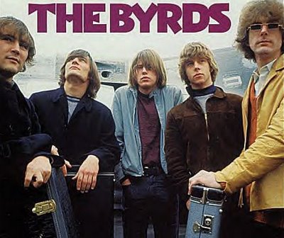
                                        The Looking in Different Directions thing goes back a fair bit:


                                        In answer to Reed's question, I tend to think it started on the West Coast at around this time. I goes with the informal, unsmiling, backs to the audience, too-cool-for school look that Dylan popularised.

                                        Comment


                                          #21
                                          Touching From A Distance - Deborah Curtis

                                          Man, that's some deep looking in different directions from The Byrds there. They're wobbling my collies; what is it that they see?

                                          Reed, I think the cult history of the 1970s in Britain is what made Joy Division. It certainly doesn't show up on my family photos, but I suppose hip urban kids would have had access to Bowie, Roxy Music, Iggy and Lou Reed; arthouse cinema from your cruel Herzogs to your ponderous Tarkovskys, plus the popular arty stuff like A Clockwork Orange; sci-fi books were big, and very ideas-based at the time, backed up by Penguin's (sleekly designed) cheap editions of cool classics by Dostoyevsky, Kafka and those cats; plus British TV was really smart back then, they used to have proper art documentaries and TV plays on all the time. Punk was really the main catalyst for all that creativity, though.

                                          One thing that's especially impressive to us 90s types is how young those sophisticated groups were. Joy Division did everything in their early 20s.

                                          Comment


                                            #22
                                            Touching From A Distance - Deborah Curtis

                                            Man, that's some deep looking in different directions from The Byrds there. They're wobbling my collies; what is it that they see?

                                            Well if you can't see it too man, you're obviously not supposed to know.

                                            Can ya dig it?

                                            Comment


                                              #23
                                              Touching From A Distance - Deborah Curtis

                                              Can't get much more black and white than this in 1978:

                                              Comment


                                                #24
                                                Touching From A Distance - Deborah Curtis

                                                On the cult factor, it's worth recalling that Malcolm McLaren, Jamie Reid and Tony Wilson were all educated in the 1960s and looking for something to bring back the spirit of 1968. The punks needed those disillusioned 60s survivors to guide them into the music industry, without which they'd have been doing small local dingy clubs at best and the fashion and LP art would never have taken off.

                                                Typography was also a movement in itself. Malcolm Garrett and Peter Saville both acknowledged this influence:

                                                http://en.wikipedia.org/wiki/Jan_Tschichold

                                                Comment


                                                  #25
                                                  Touching From A Distance - Deborah Curtis

                                                  Lucia Lanigan wrote:
                                                  One thing that's especially impressive to us 90s types is how young those sophisticated groups were. Joy Division did everything in their early 20s.
                                                  What comes across in the books is that the cultural autodidactism was coupled with a huge lack of worldliness. Hook's account includes accounts of how he tried Chinese food for the first time and generally avoided foreign food on tour because his mum had told him it was 'dirty'. Maybe the lack of first hand experience helped to enhance that world of the imagination.

                                                  Annik Honore died recently and was a considerable figure in her own right in the history of Factory Benelux and Les Disques Du Crepuscule. Both she and Deborah Curtis are perhaps diminished by a telling of the story that reflects the division between band life and home life that Tony Wilson and Rob Gretton encouraged because it made for better carousing but also insulated the band from outside opinions. Their respective experiences confirm some of the lessons on the Wives And Lovers thread.

                                                  Comment

                                                  Working...
                                                  X